
PIRTTI
Brand Launch
DESIGN
PHOTO DIRECTION
COPY + VOICE
STRATEGY


BRAND STRATEGY
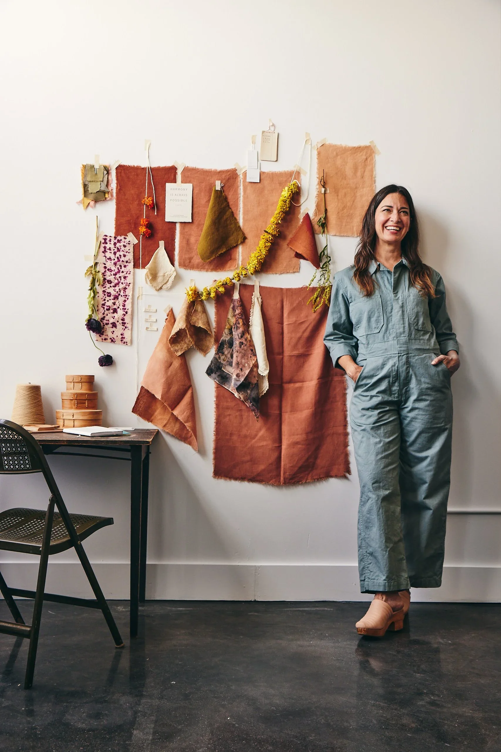
Bringing Pirtti to life began with a brand strategy workshop, clarifying artist and founder Anne-Marie Kavulla’s vision for circular, slowly made textile goods into a cohesive brand direction.
VISUAL IDENTITY
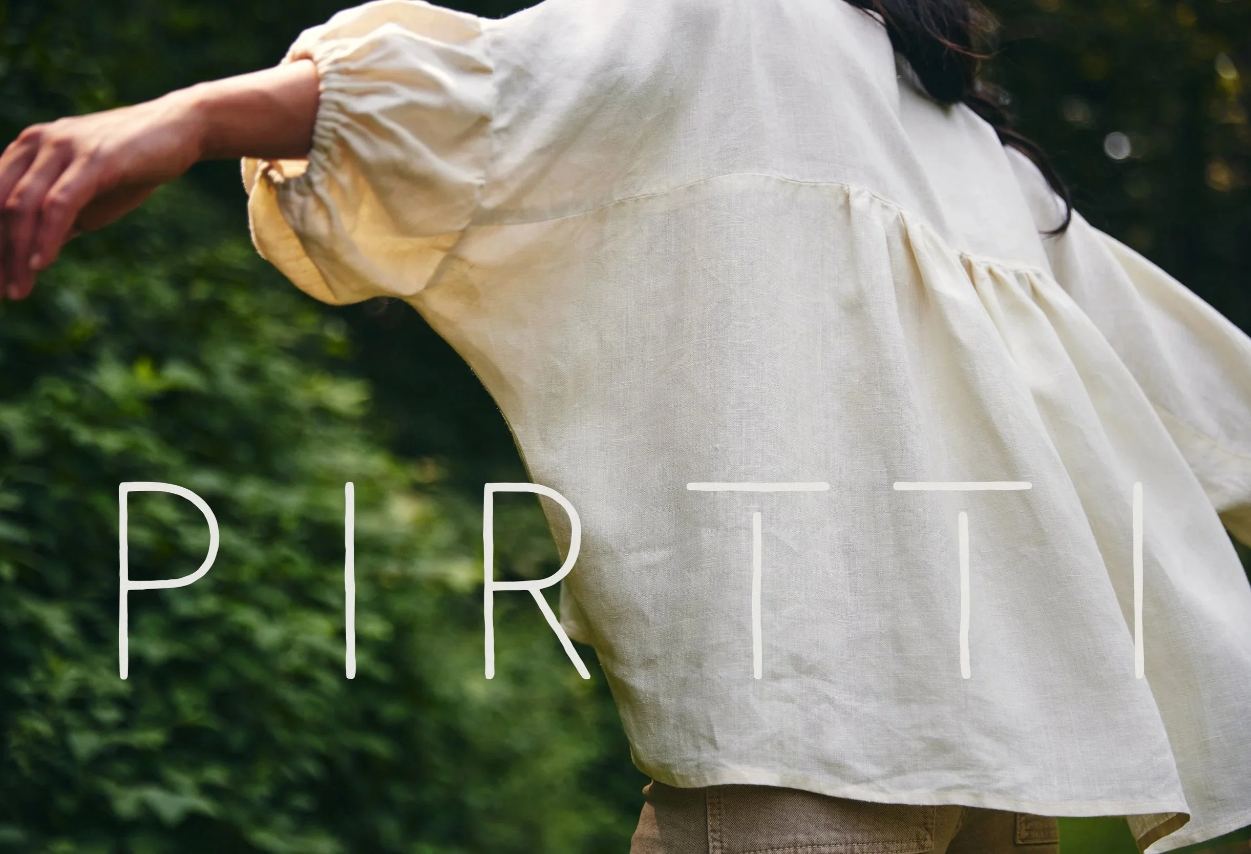
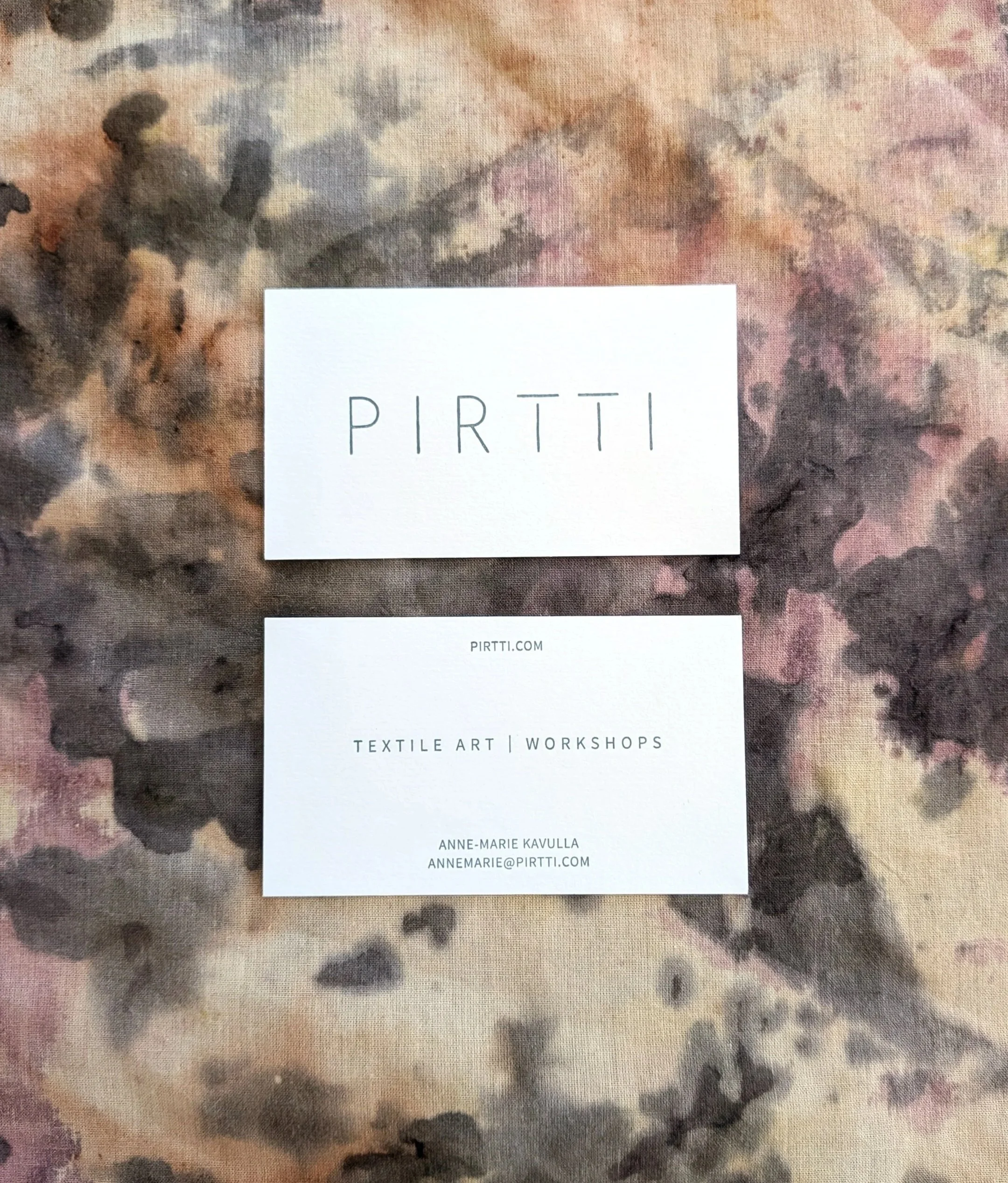
The visual identity evokes Pirtti’s communal, experimental, and natural spirit.
A hand-crafted logo features an abstract representation of a supportive structure, with openness and flexibility.



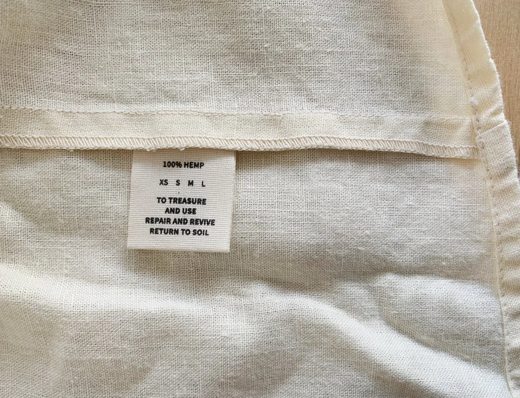
PACKAGING
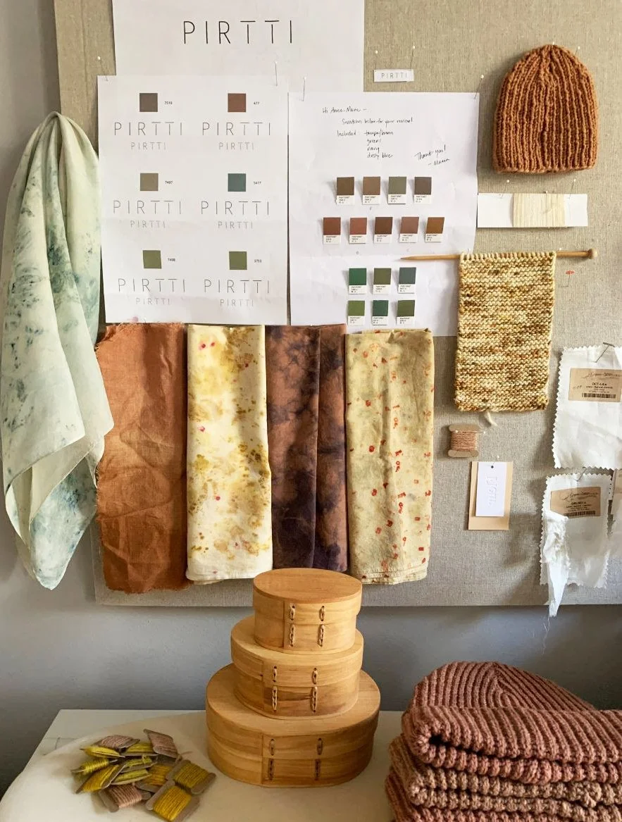
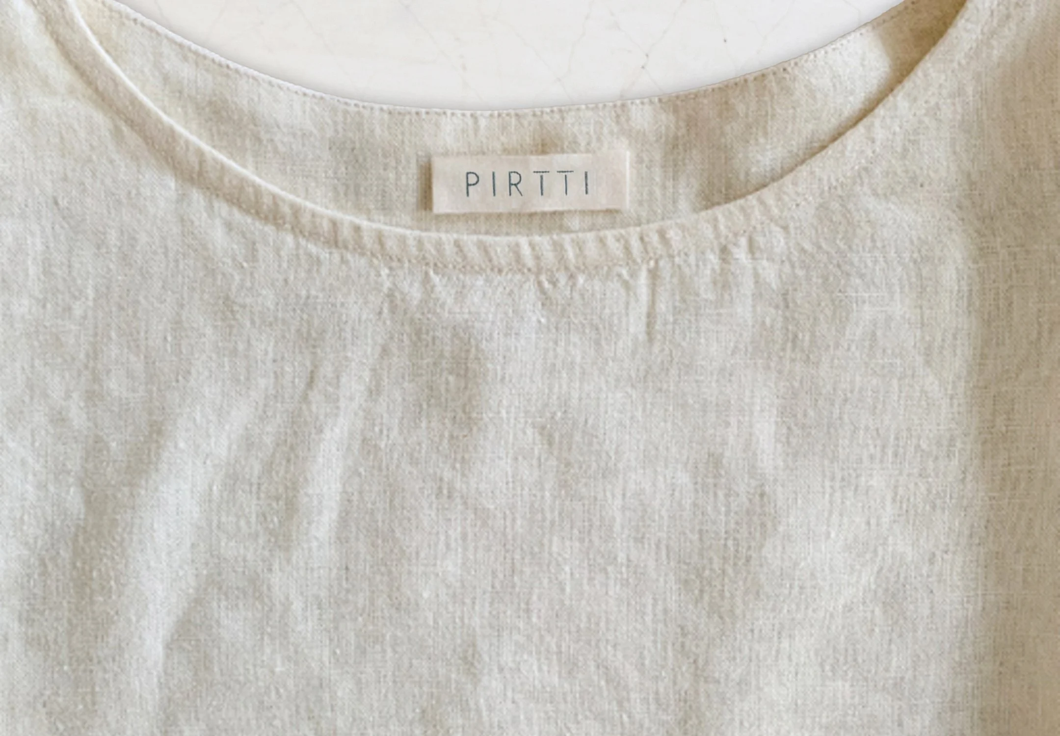
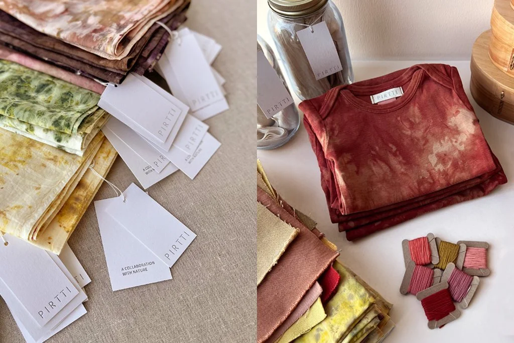
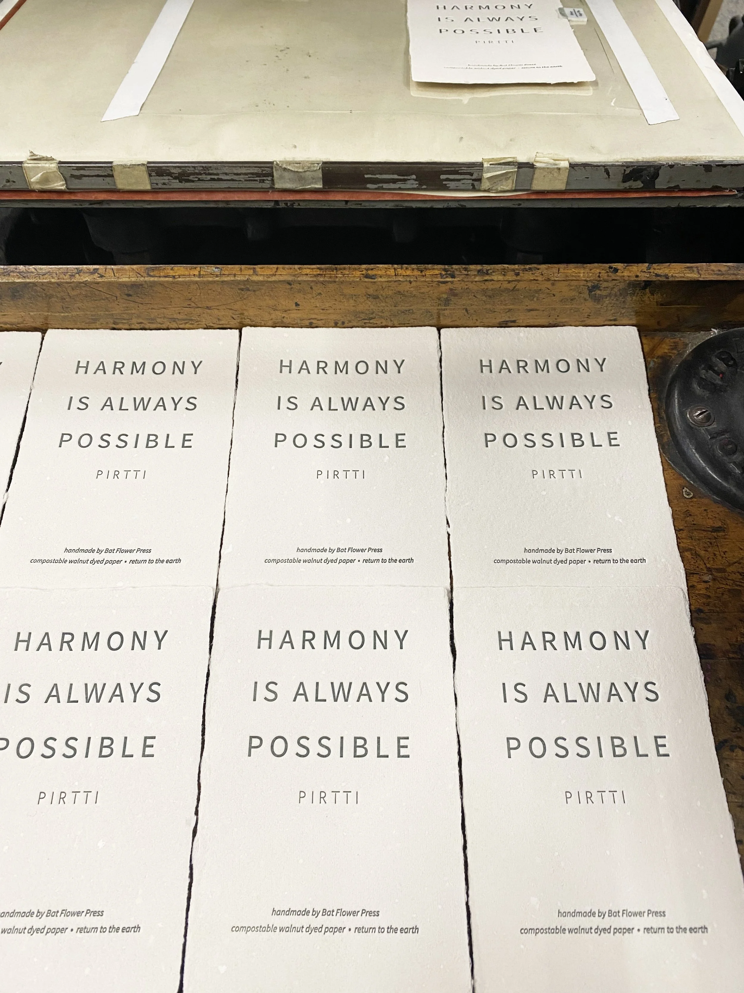
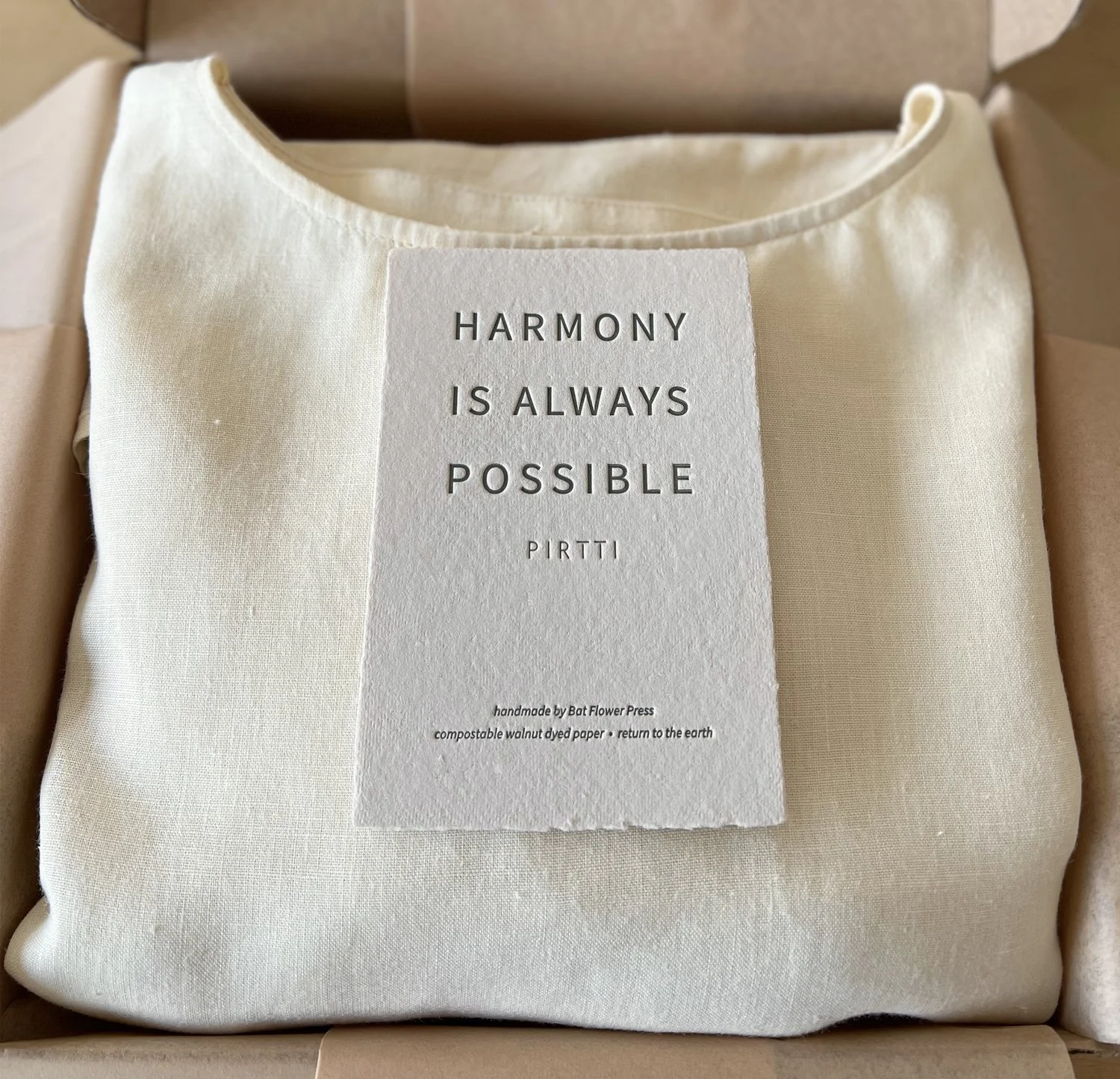
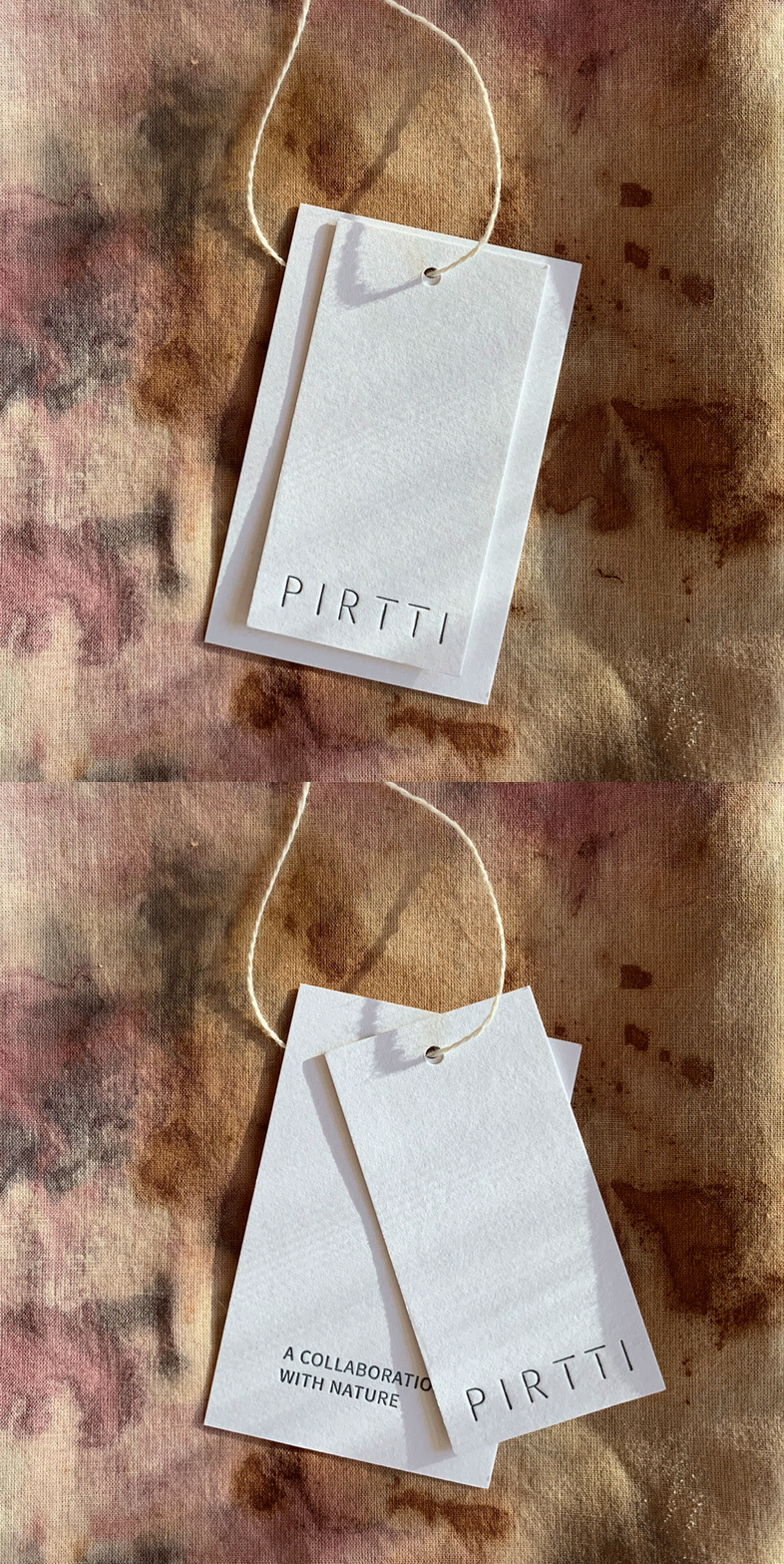
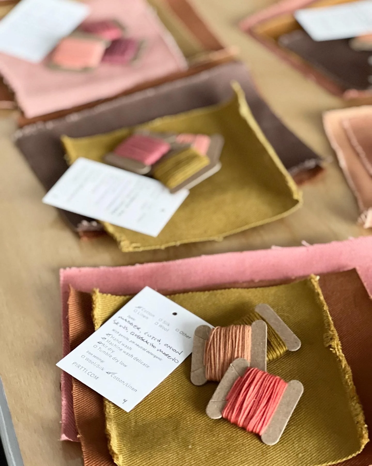
The brand’s visual language and steadfast care for the environment came to life in custom garment labels, hang tags, packaging, and printed ephemera, produced from organic cotton, sugarcane, and recycled handmade paper.
COPY
Pirtti’s verbal identity embodied grounded, inviting optimism. A collection of guiding slogans encourages stewardship of the earth and progress over perfection.
TAGLINE
A Collaboration with Nature
MANTRA
Harmony is Always Possible
ETHOS
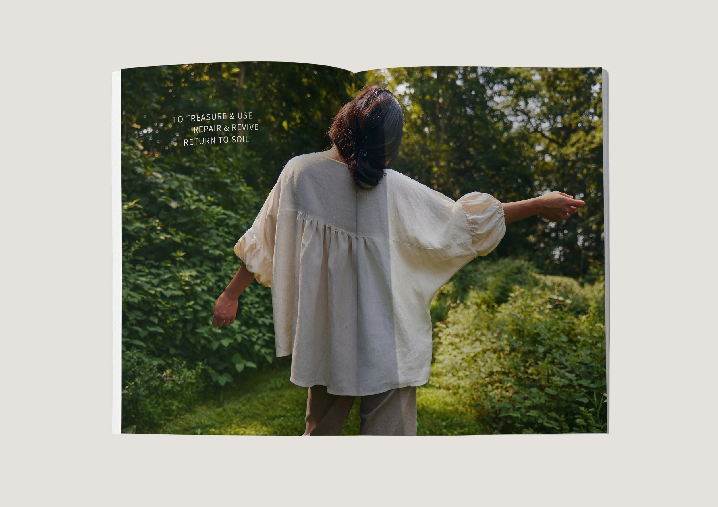
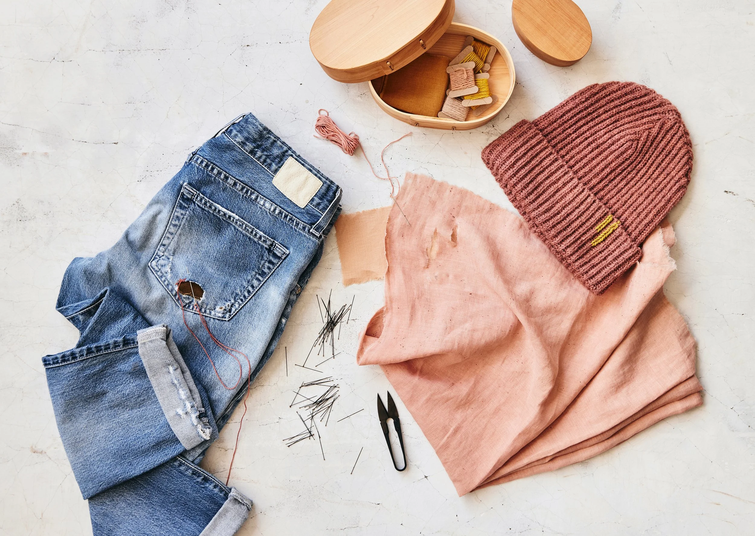
Treasure and use, repair and revive, return to soil


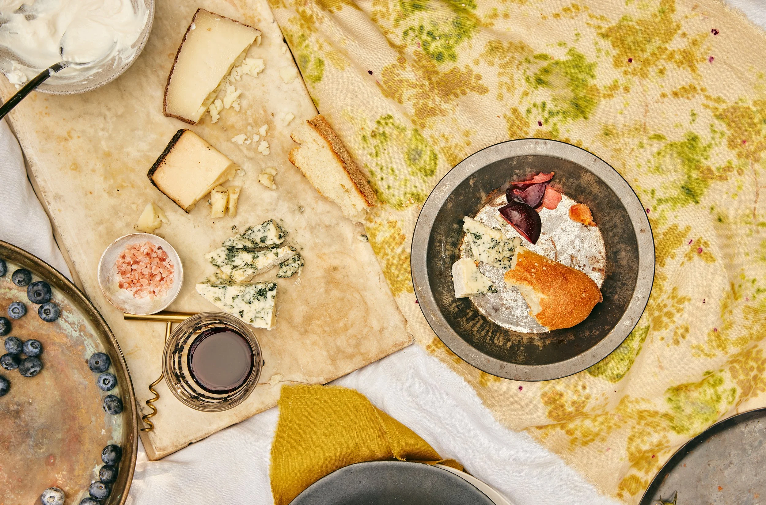
ART DIRECTION
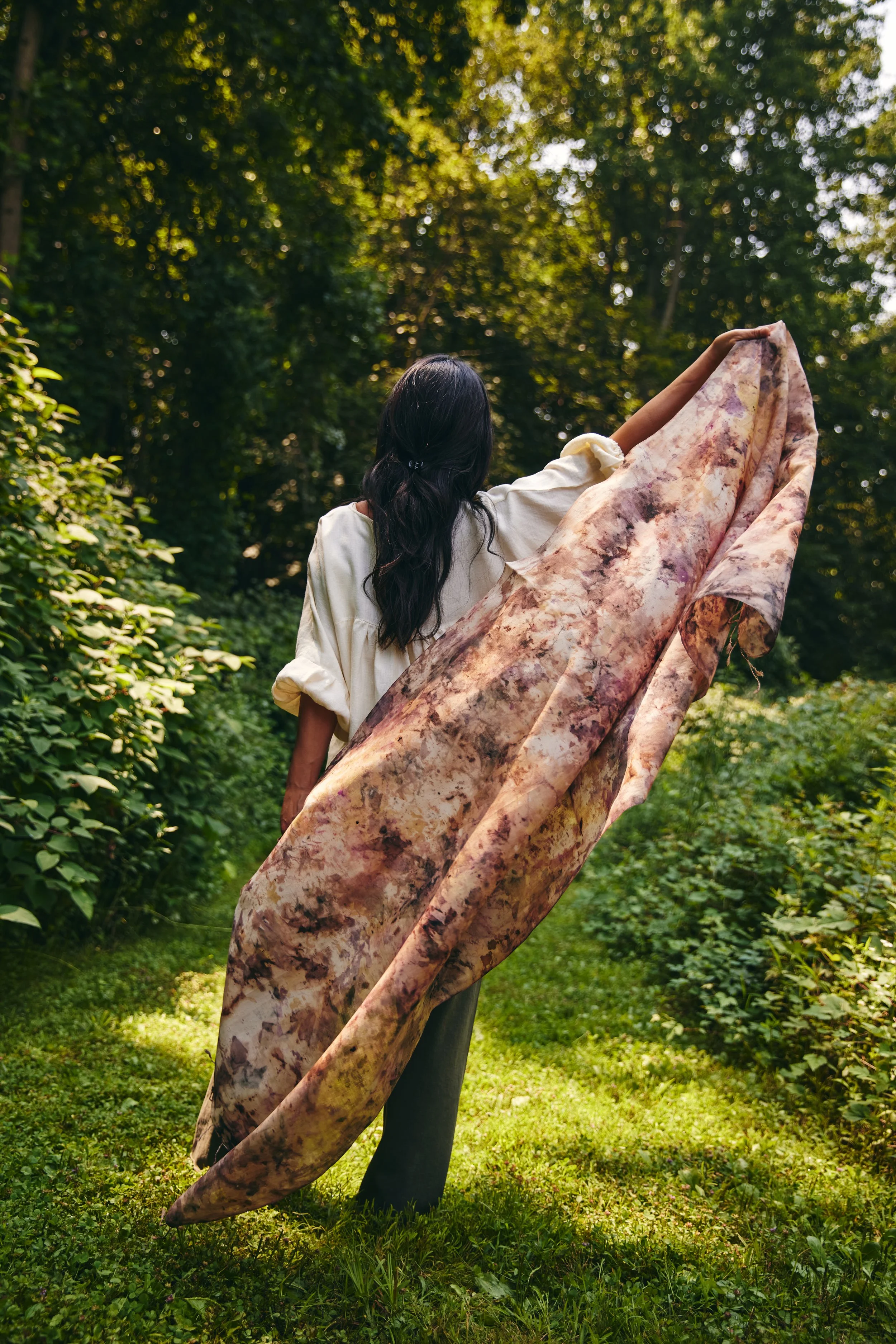
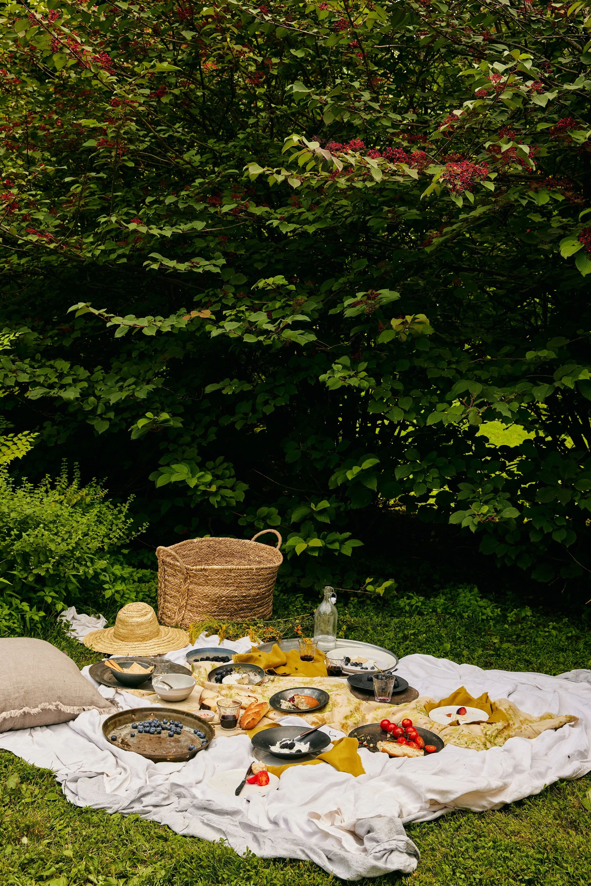
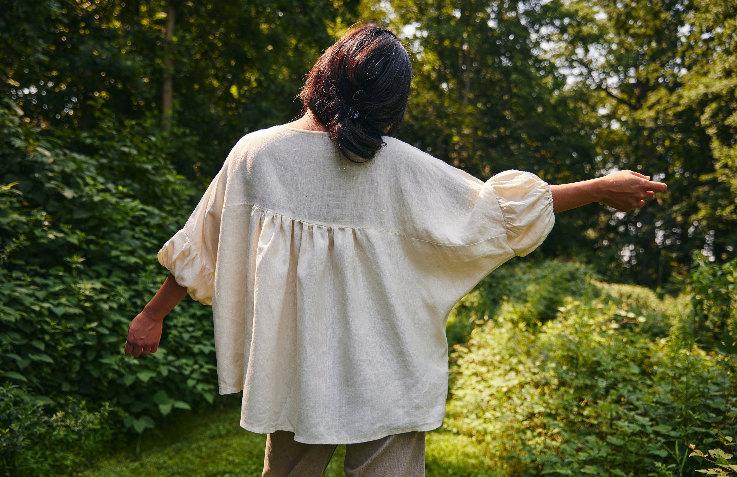
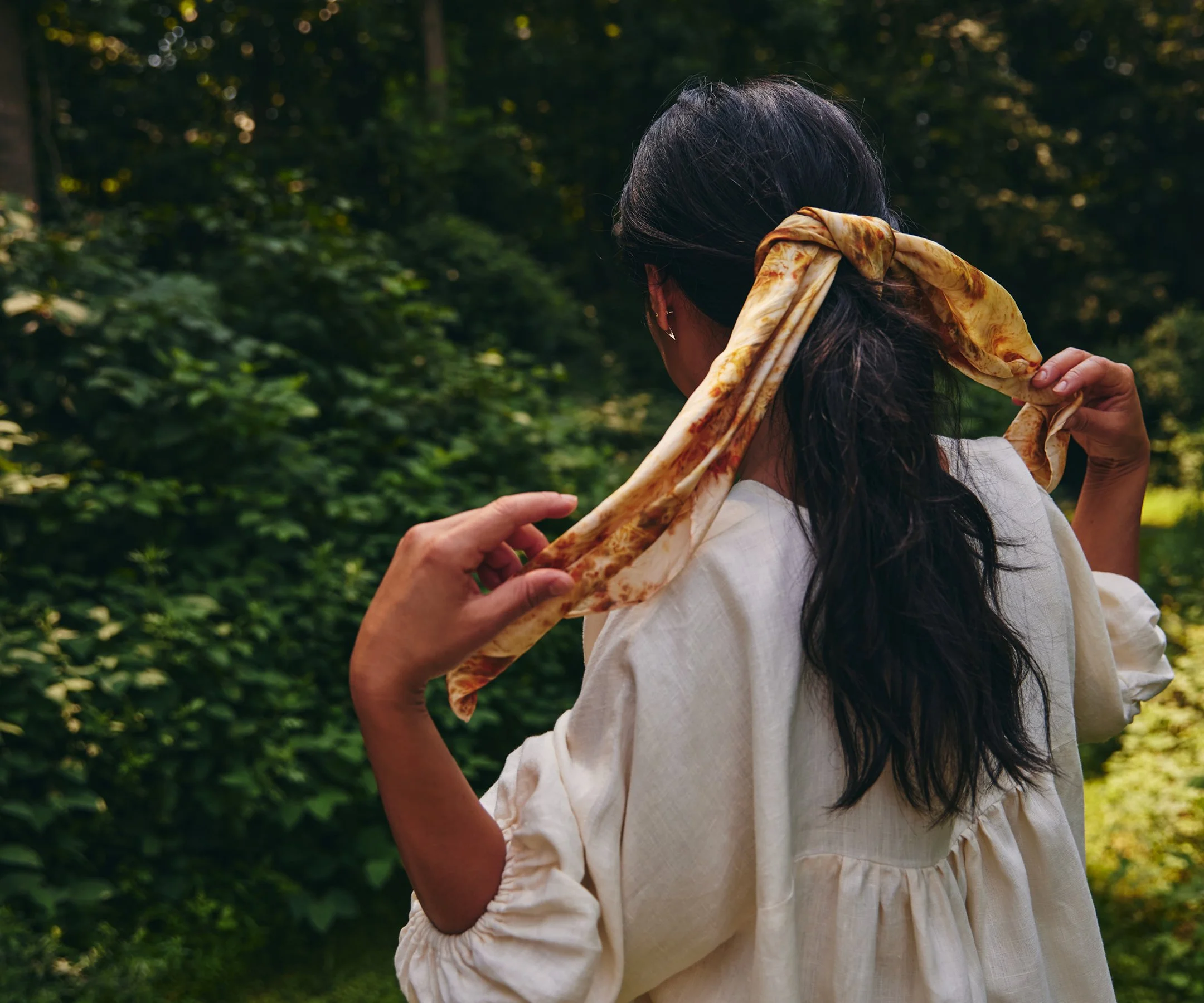
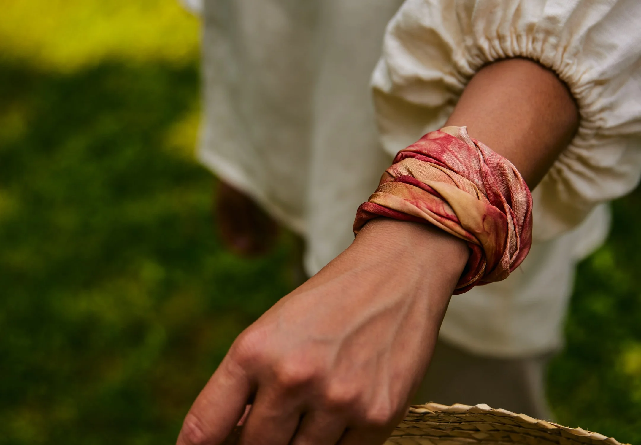
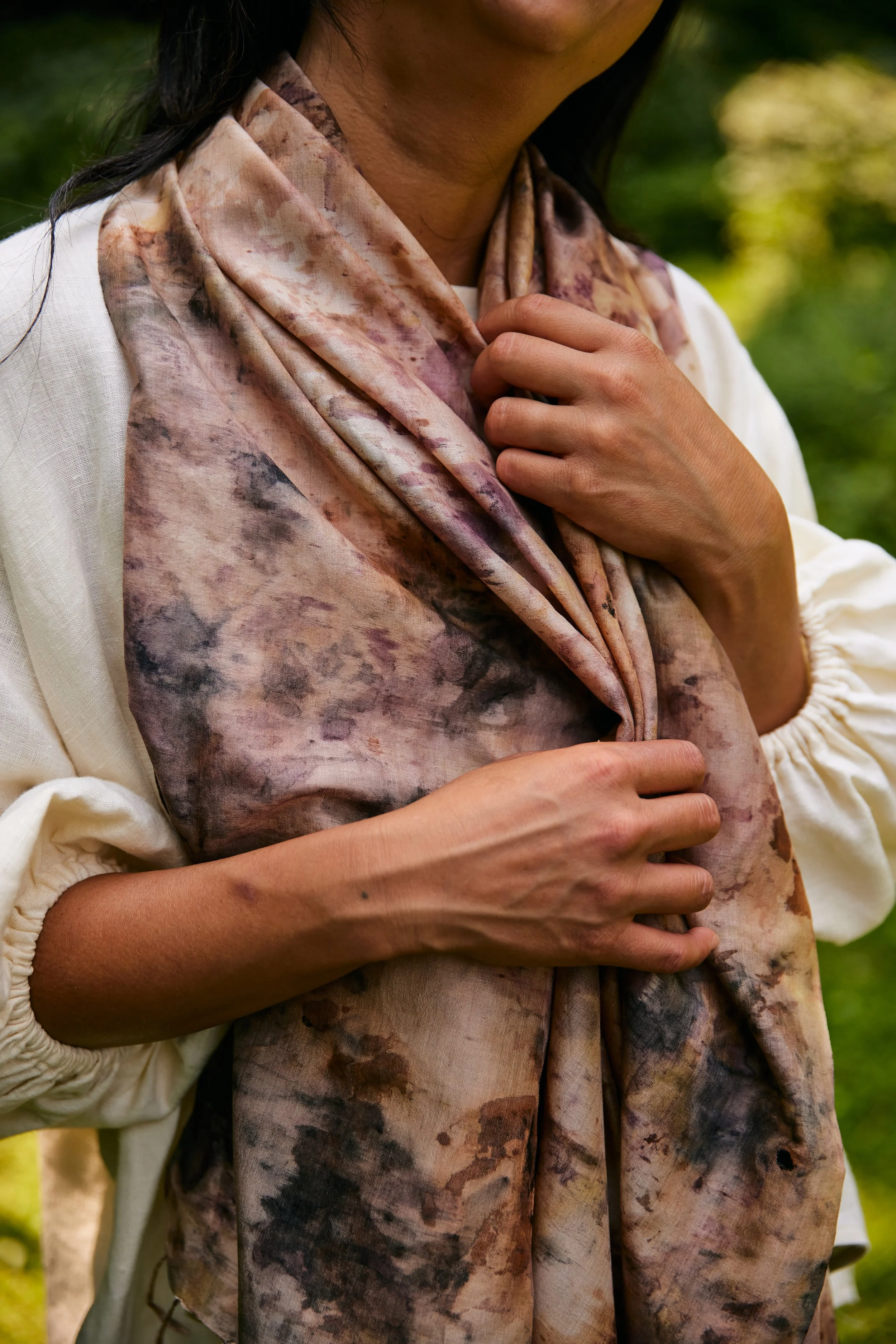
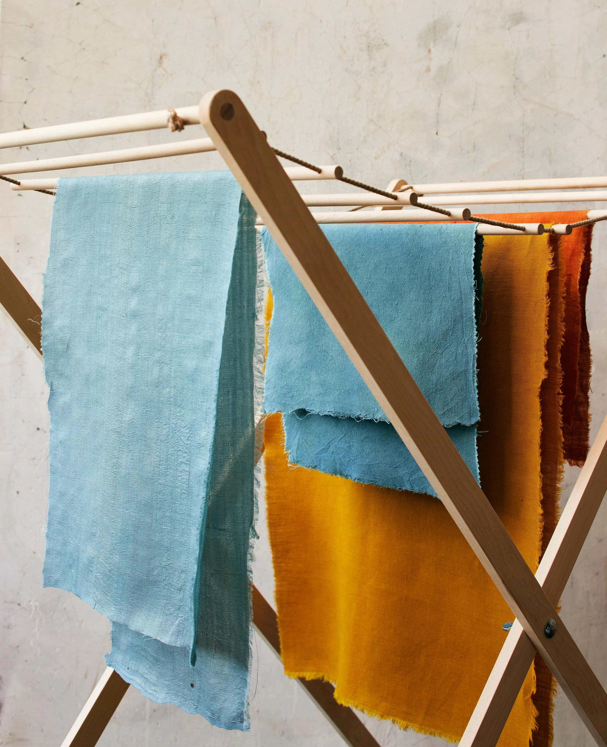
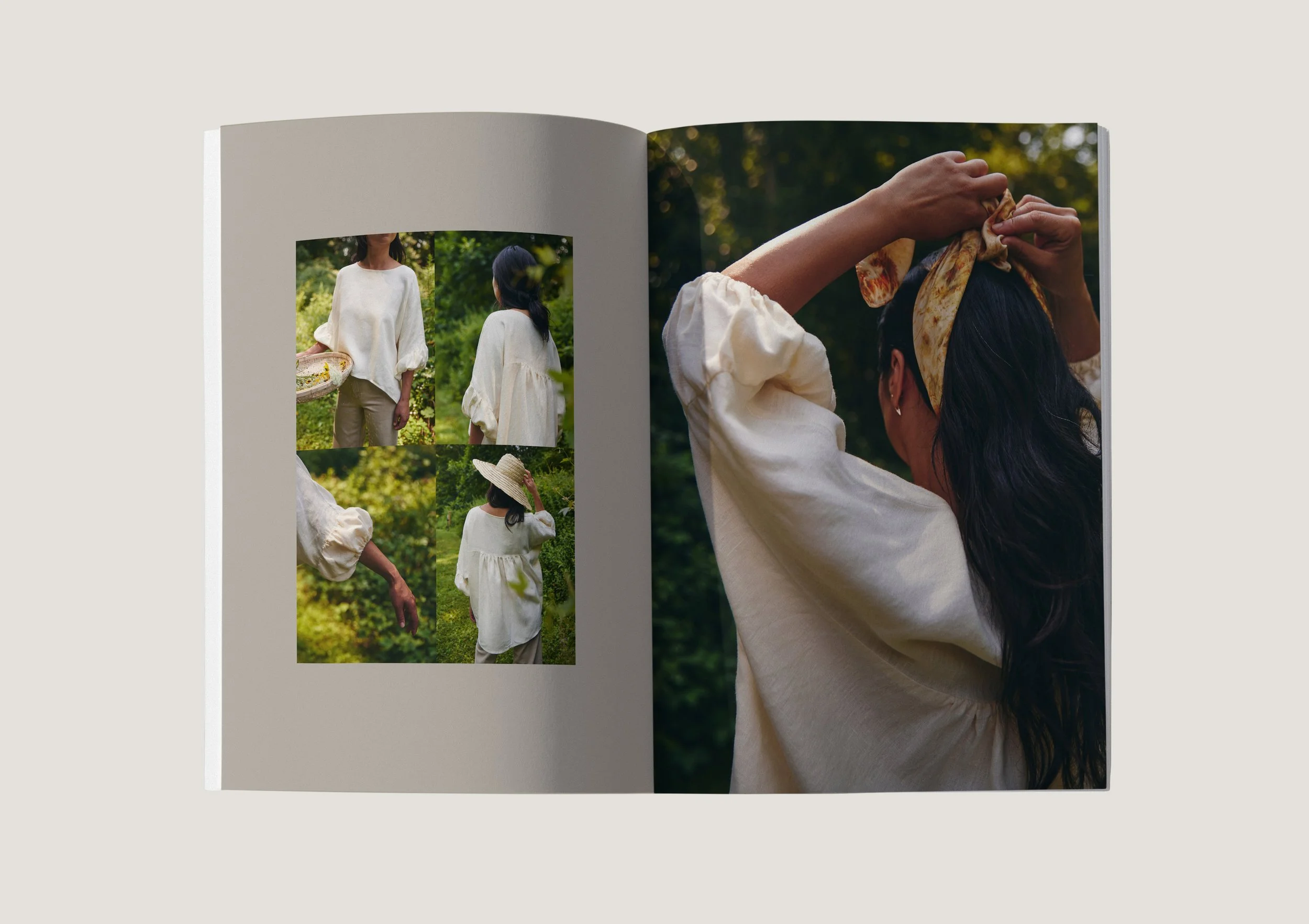
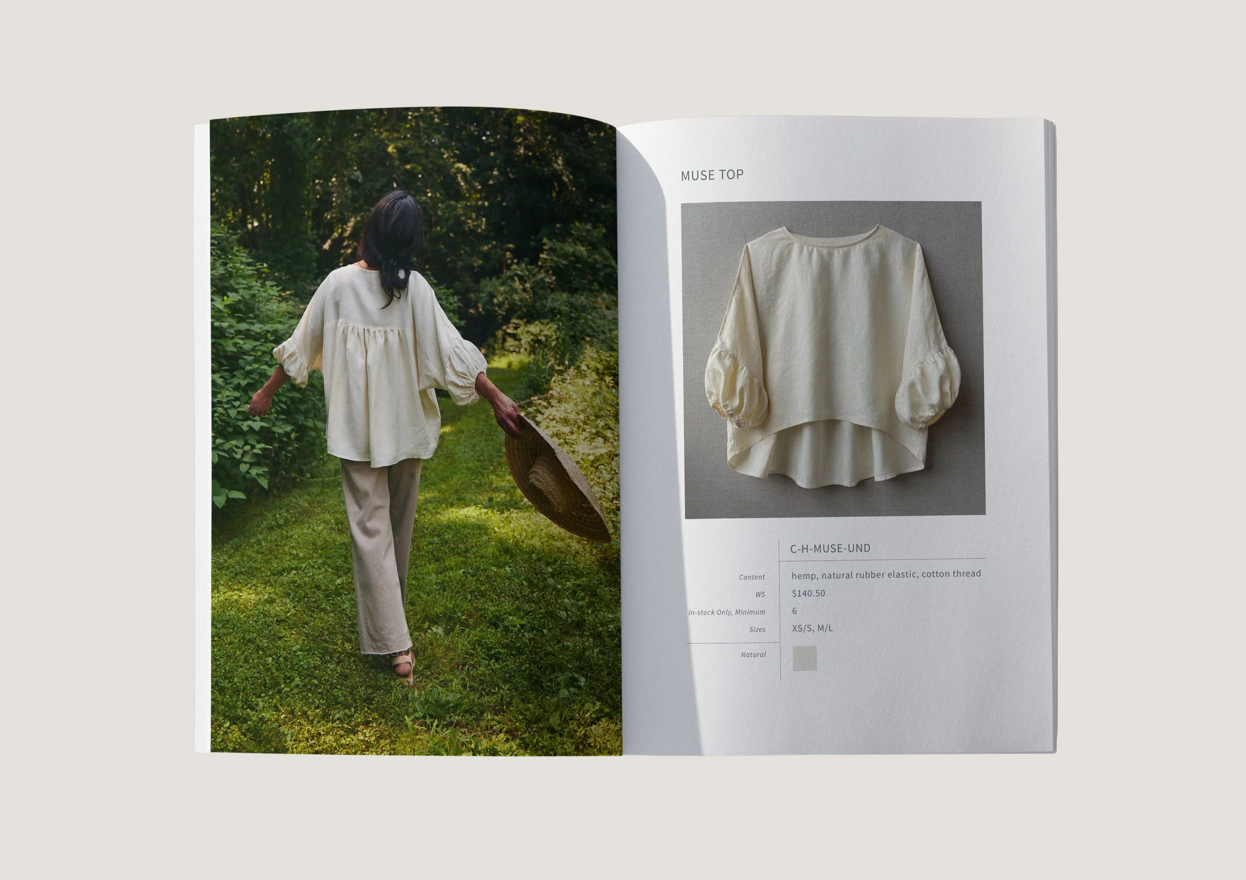
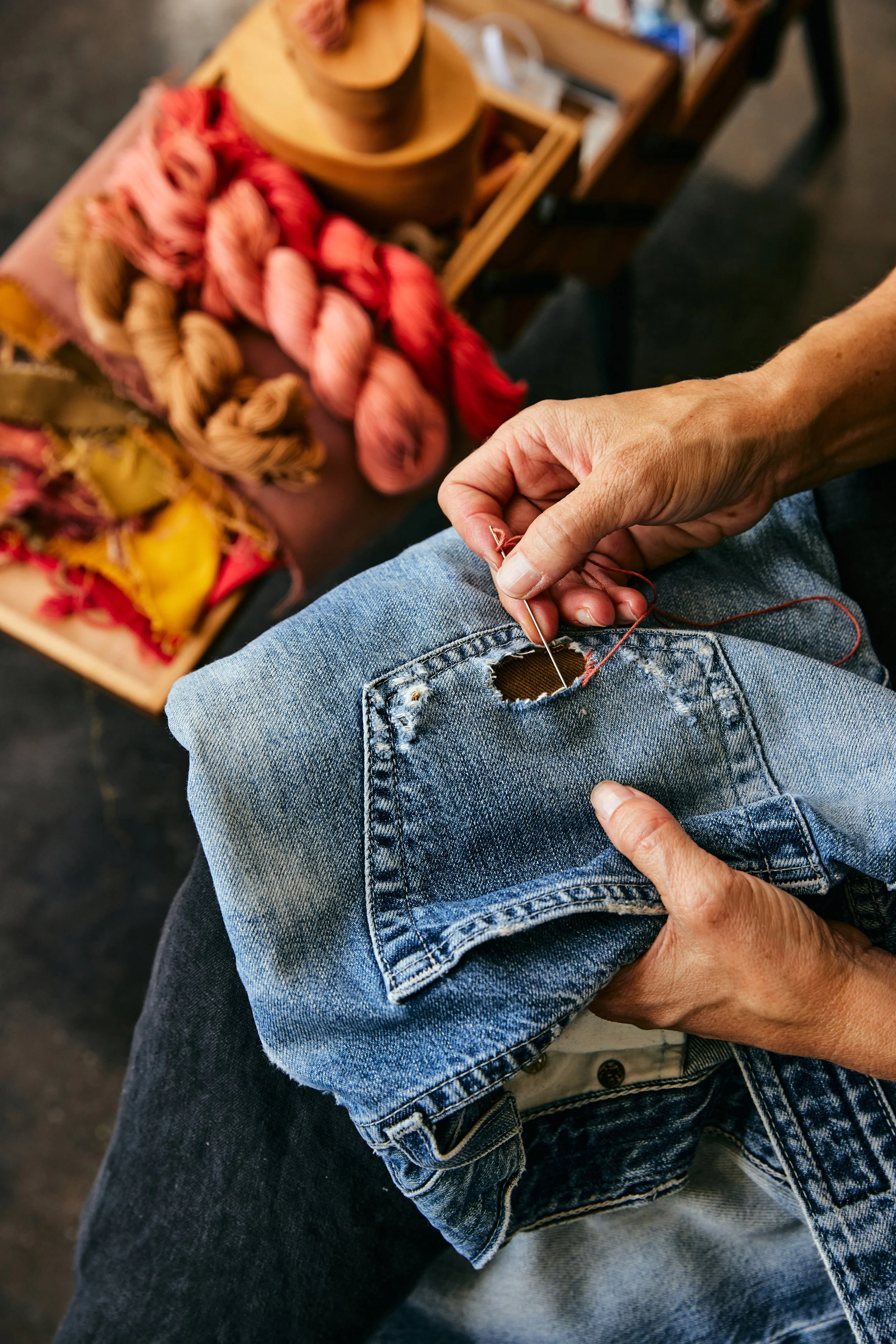
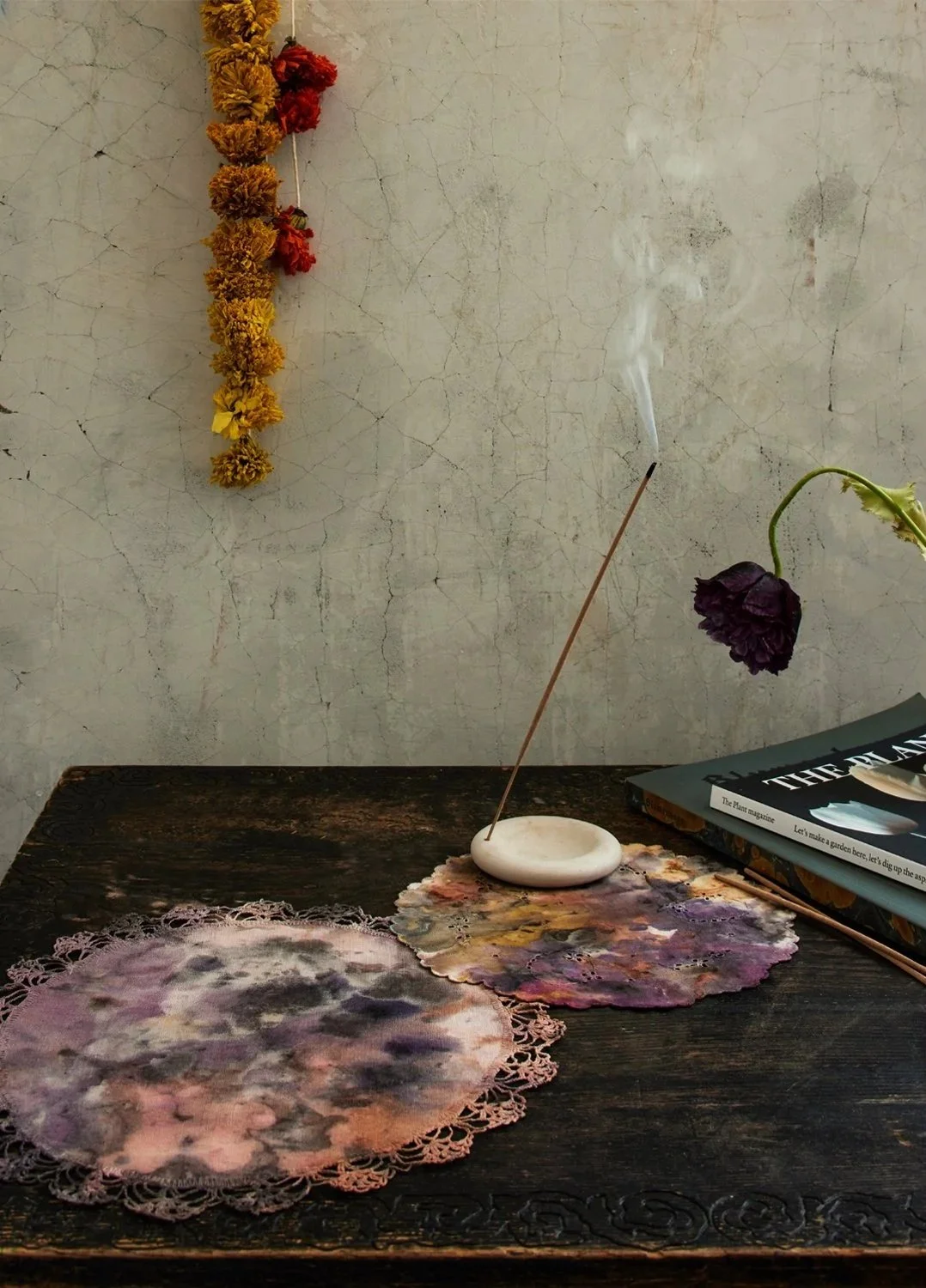
Photo art direction focused on natural, warm light and an energetic flow to convey the fluidity of the brand’s concept, process, and respect for nature.
Photography by Kate Sears.


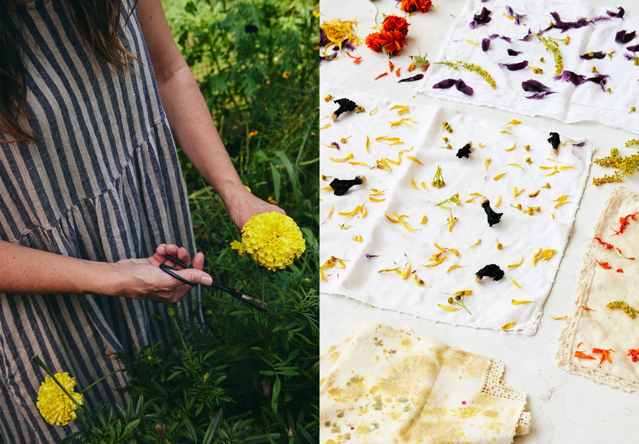
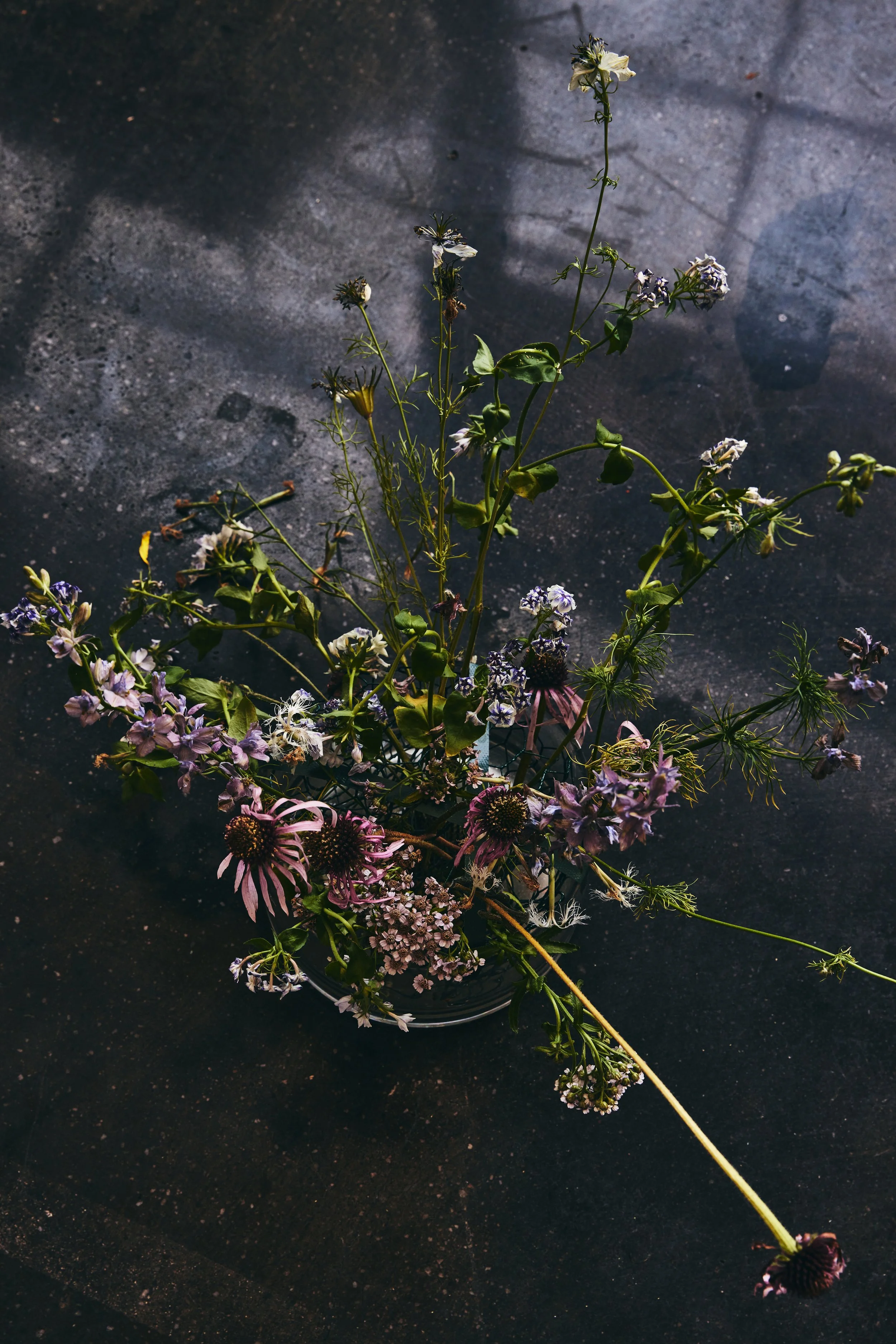


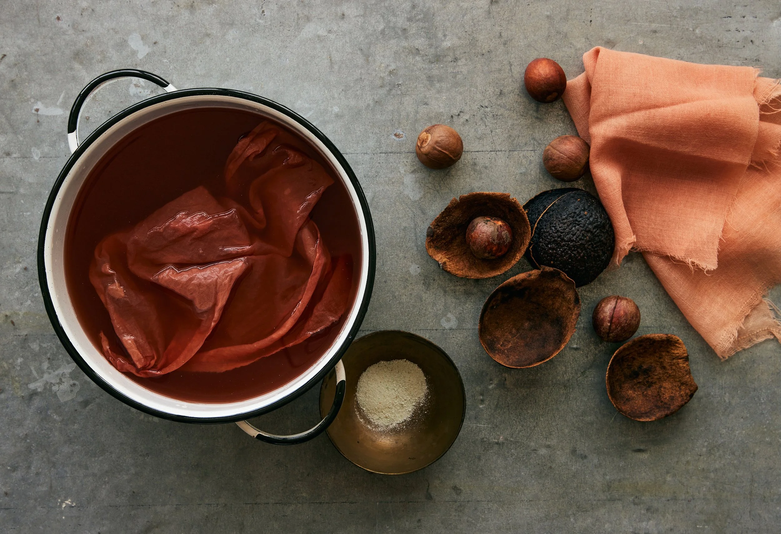
LOOKBOOK
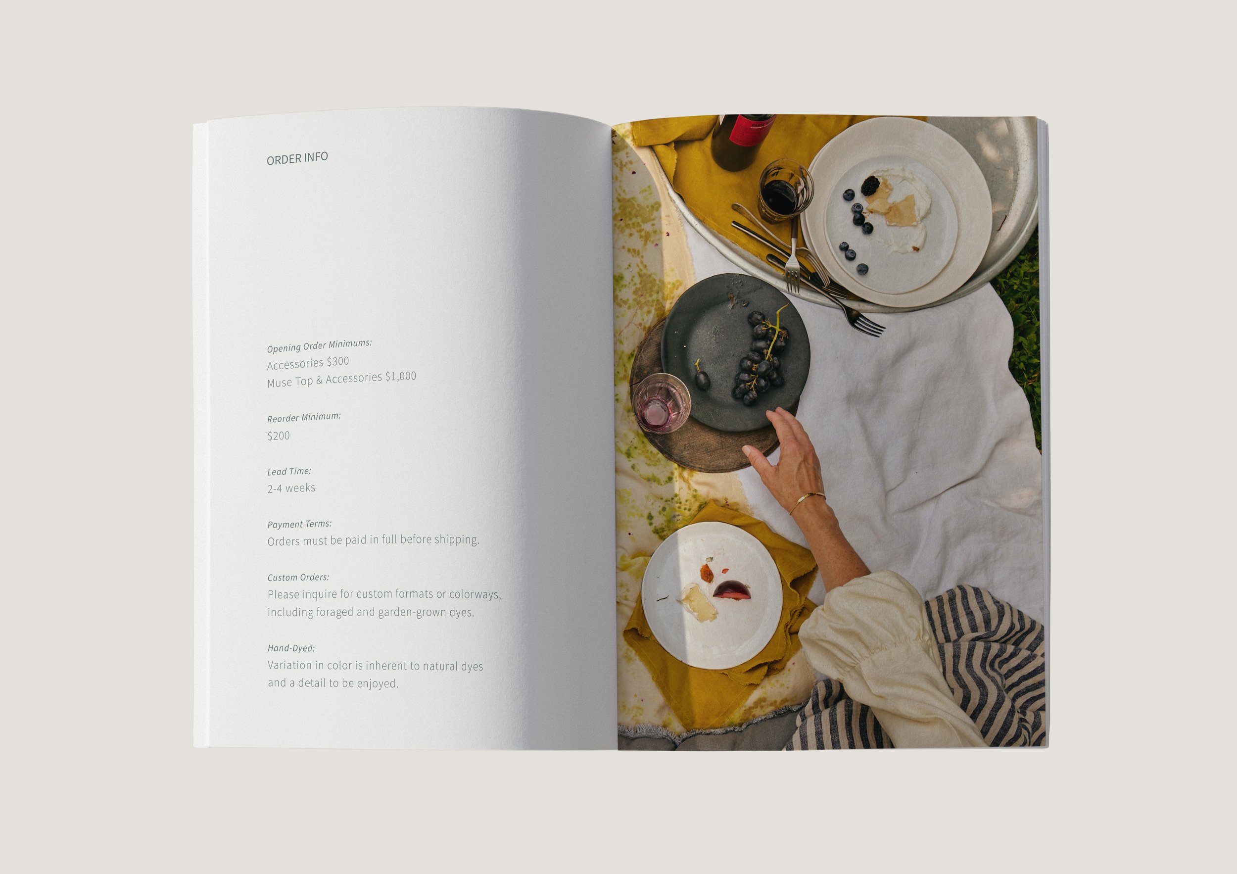
This sales tool features the story of Pirtti, its studio practice, and signature pieces.
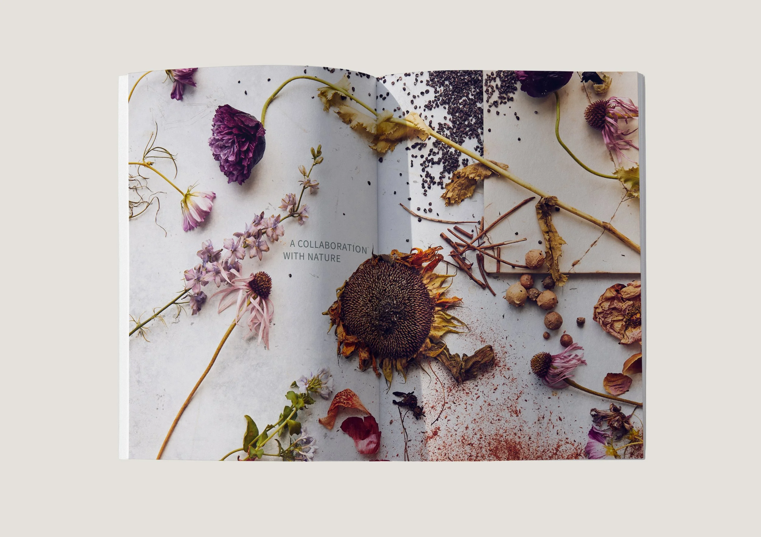
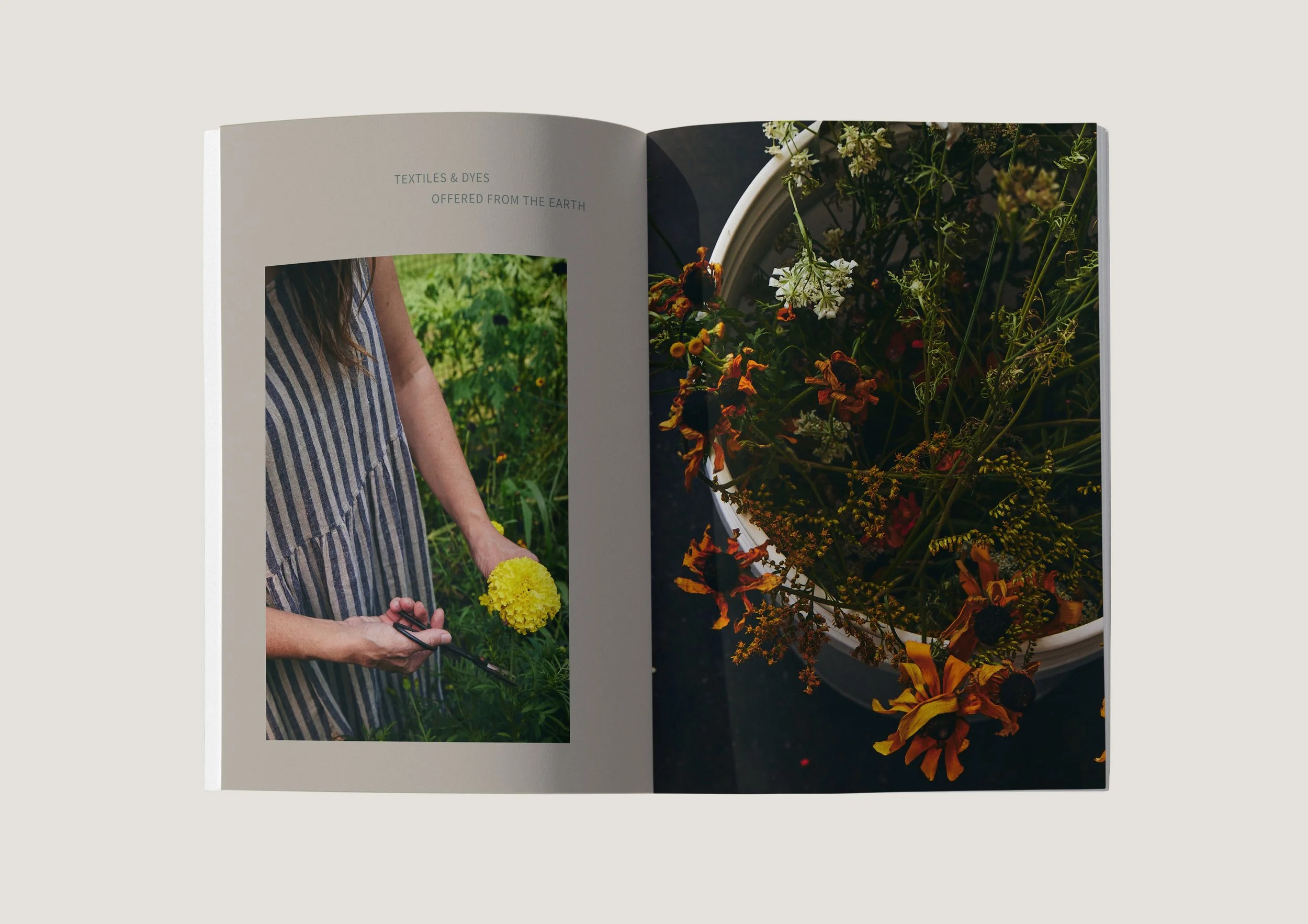
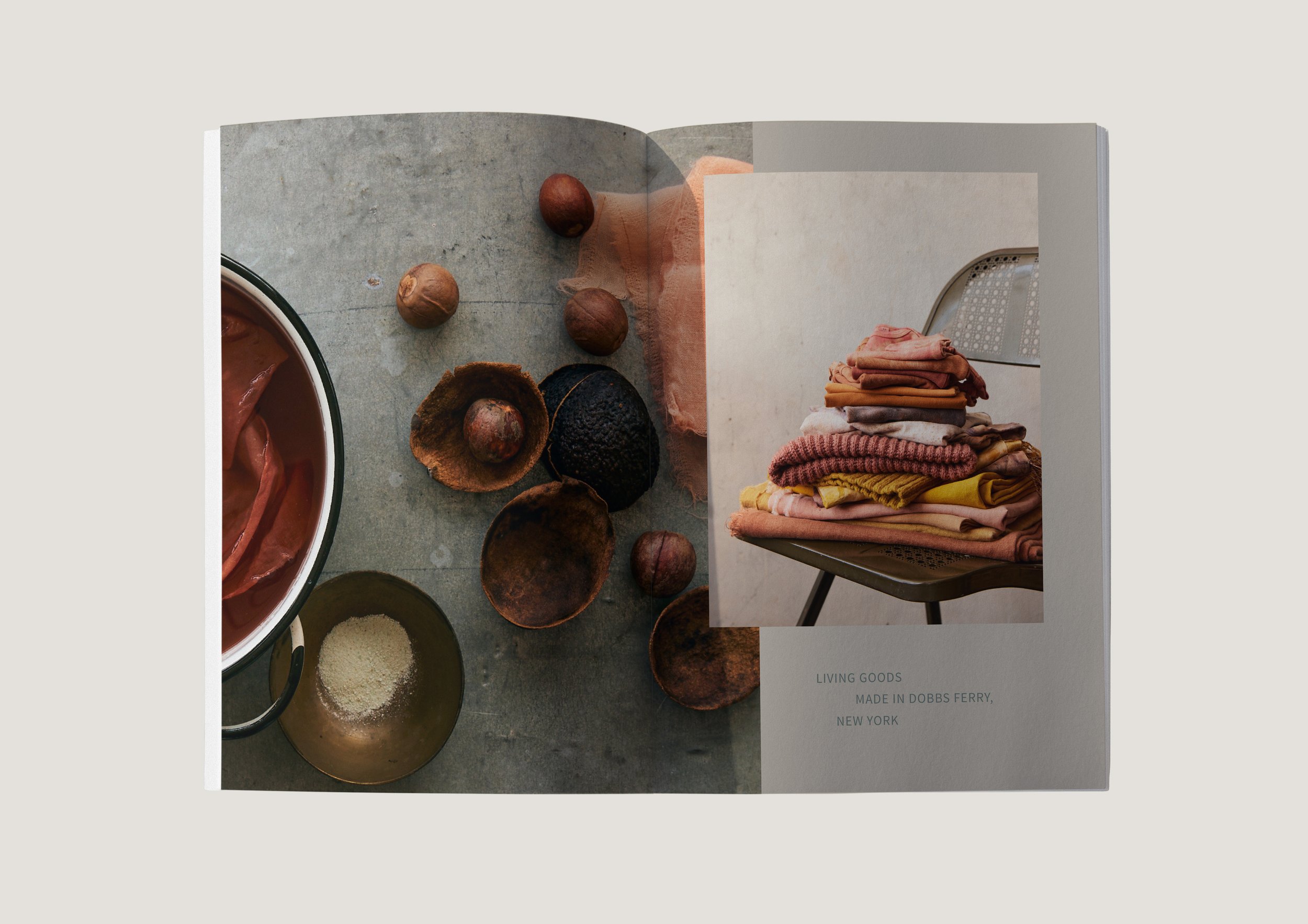


Pirtti is a craft studio that celebrates the life cycle of objects, inviting deeper respect for nature and contemplative living.