
VERLOOP
Rebrand + Packaging
DESIGN
COPY
STRATEGY
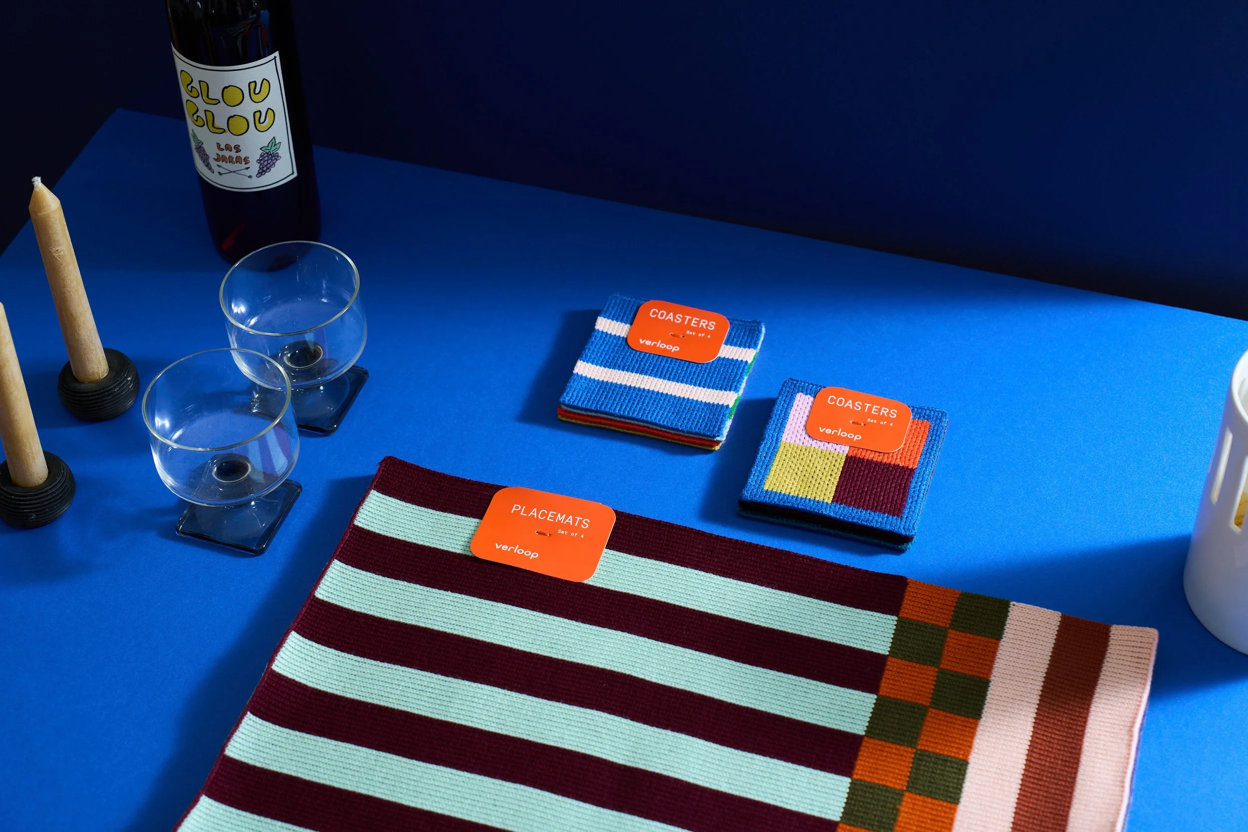
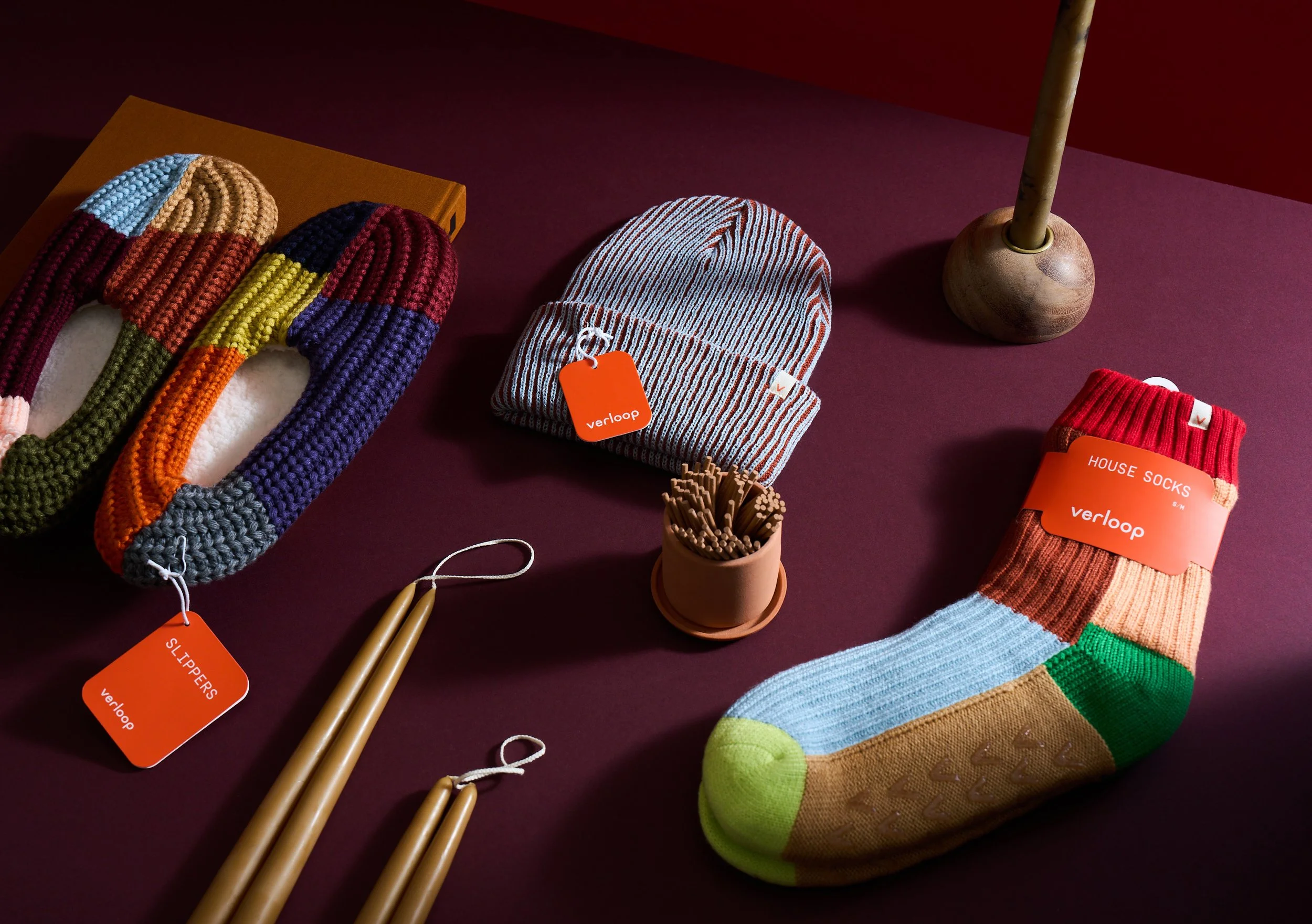
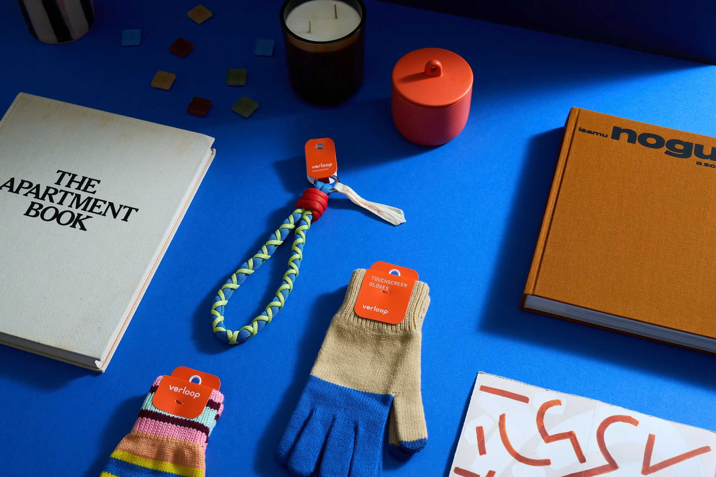
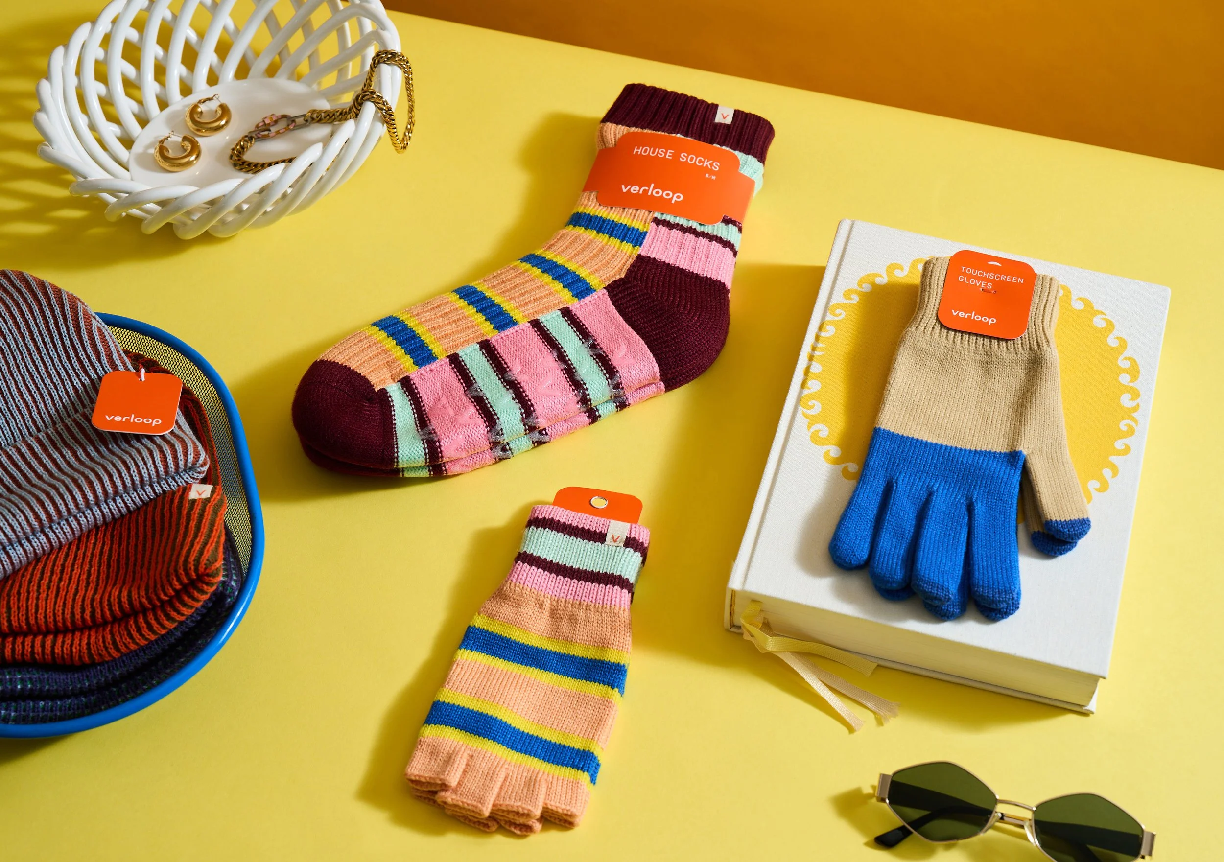
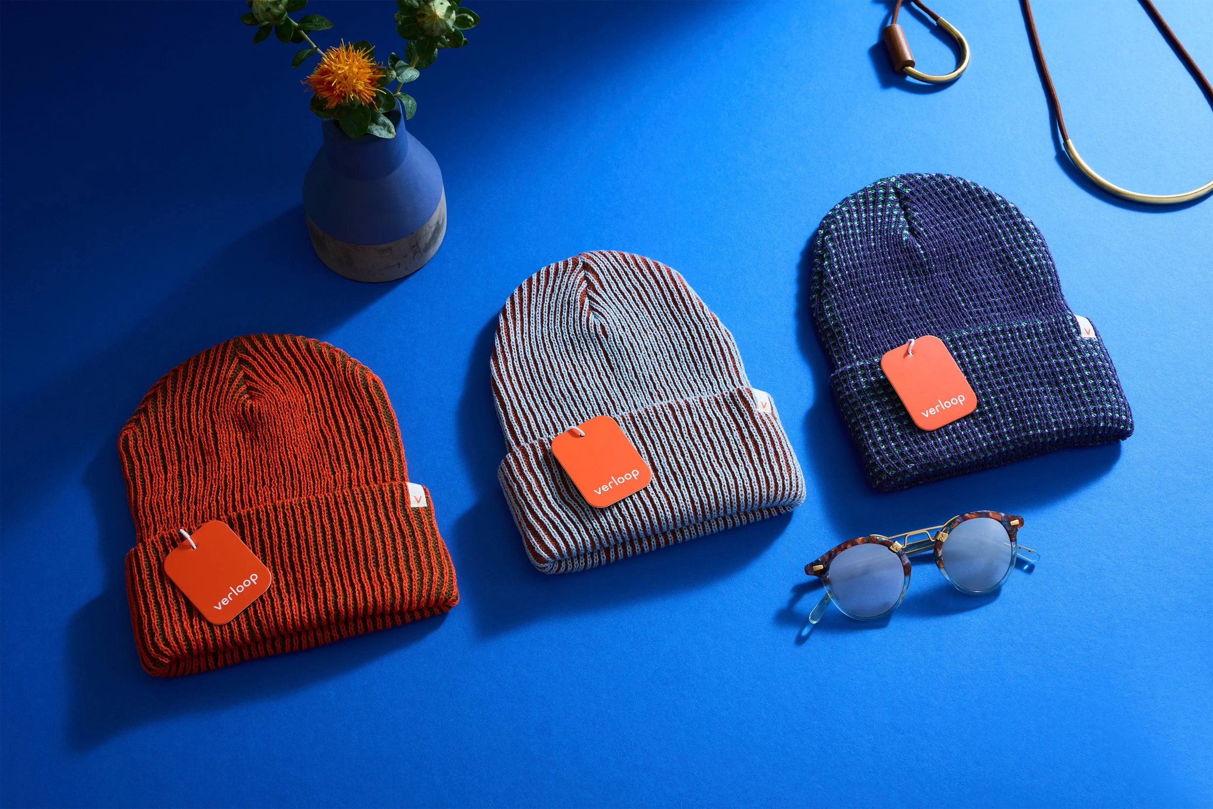
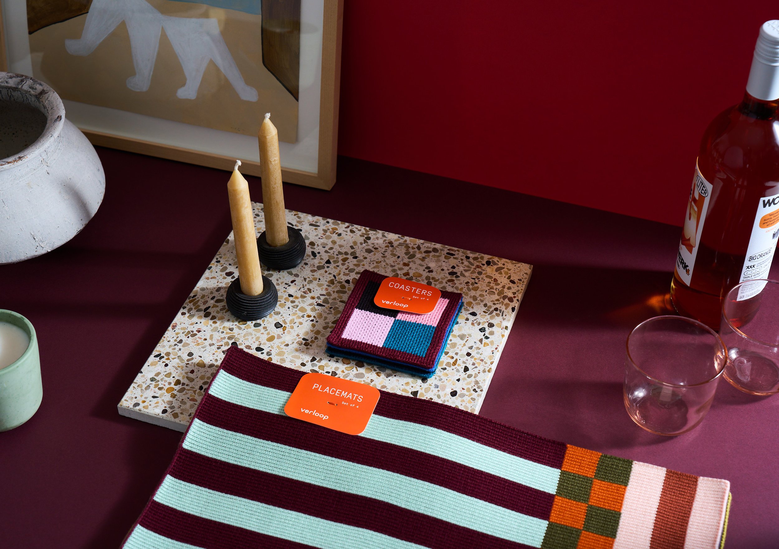
Verloop hired Fountain to holistically reimagine its brand system, from visual identity and digital presence to physical packaging and product details.
VISUAL IDENTITY
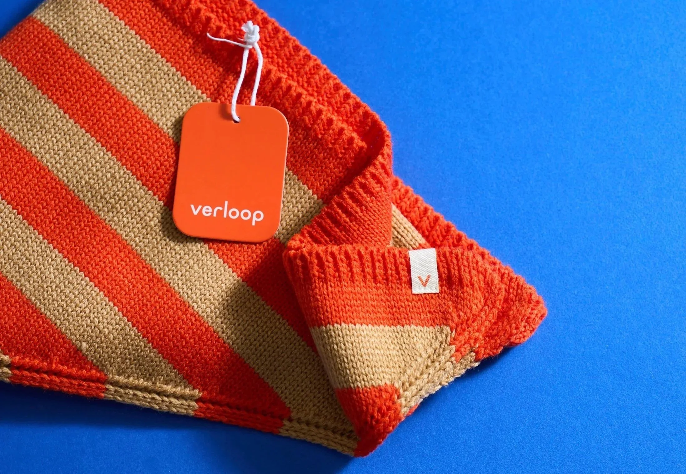
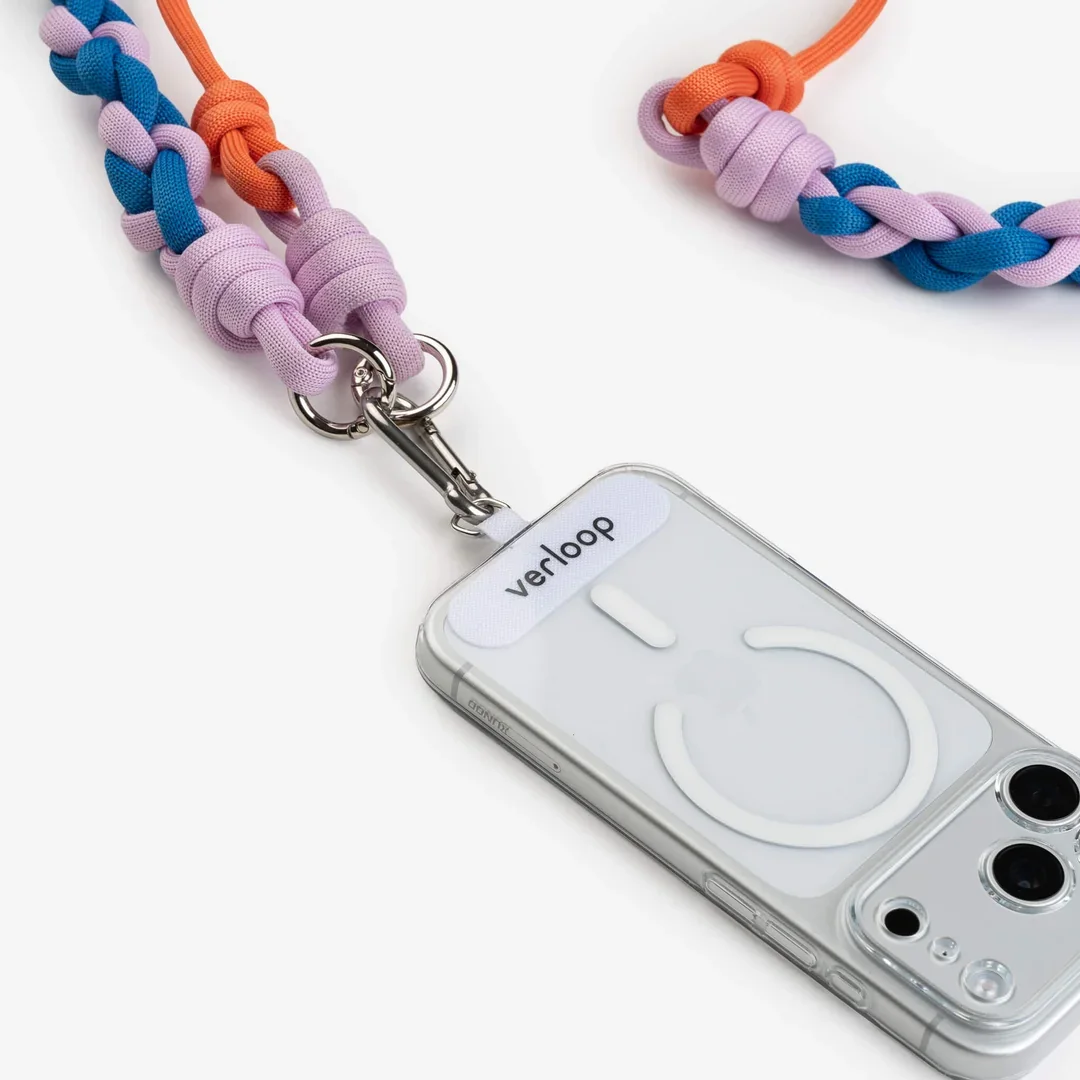
The updated visual identity shifts the brand from bubbly and tech-forward to quality-driven and design-minded, while maintaining recognition among brand fans. The result is modern, creative, and high-impact, with clean typography, a crisp V monogram and pattern, and a bold palette.

CUSTOM PACKAGING
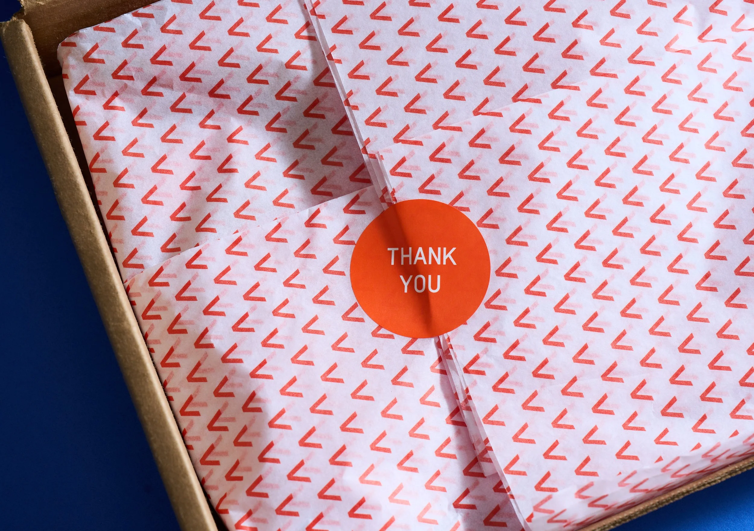
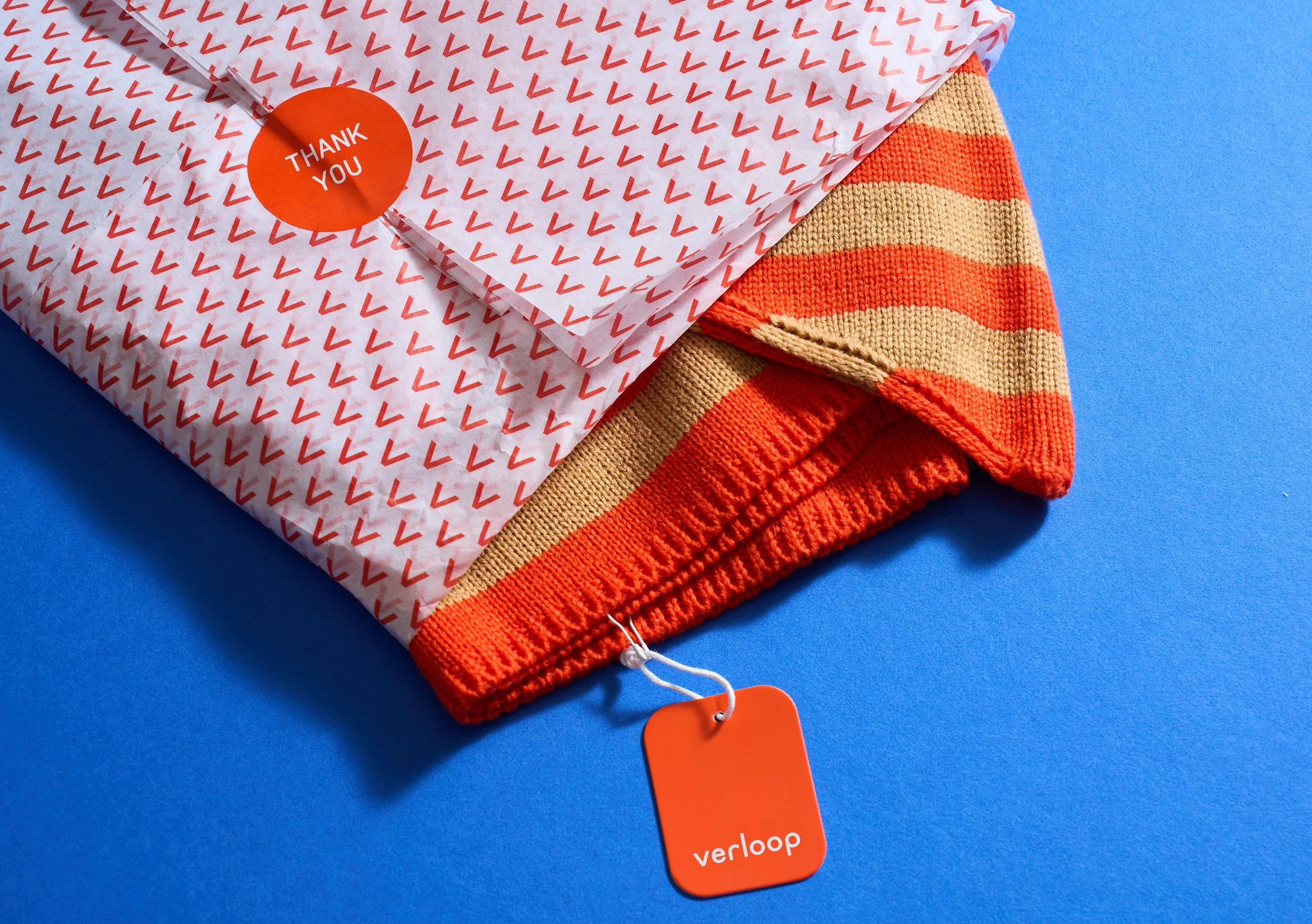
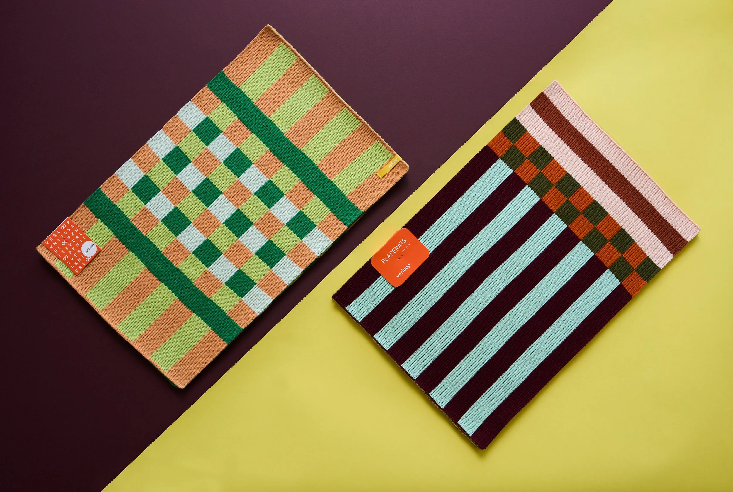
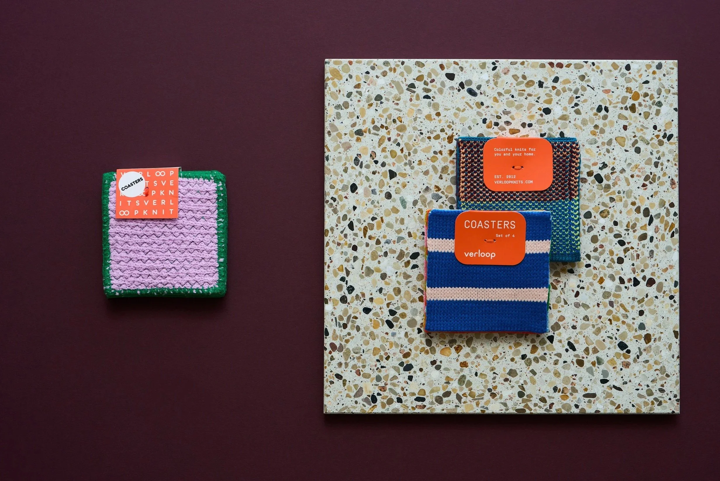
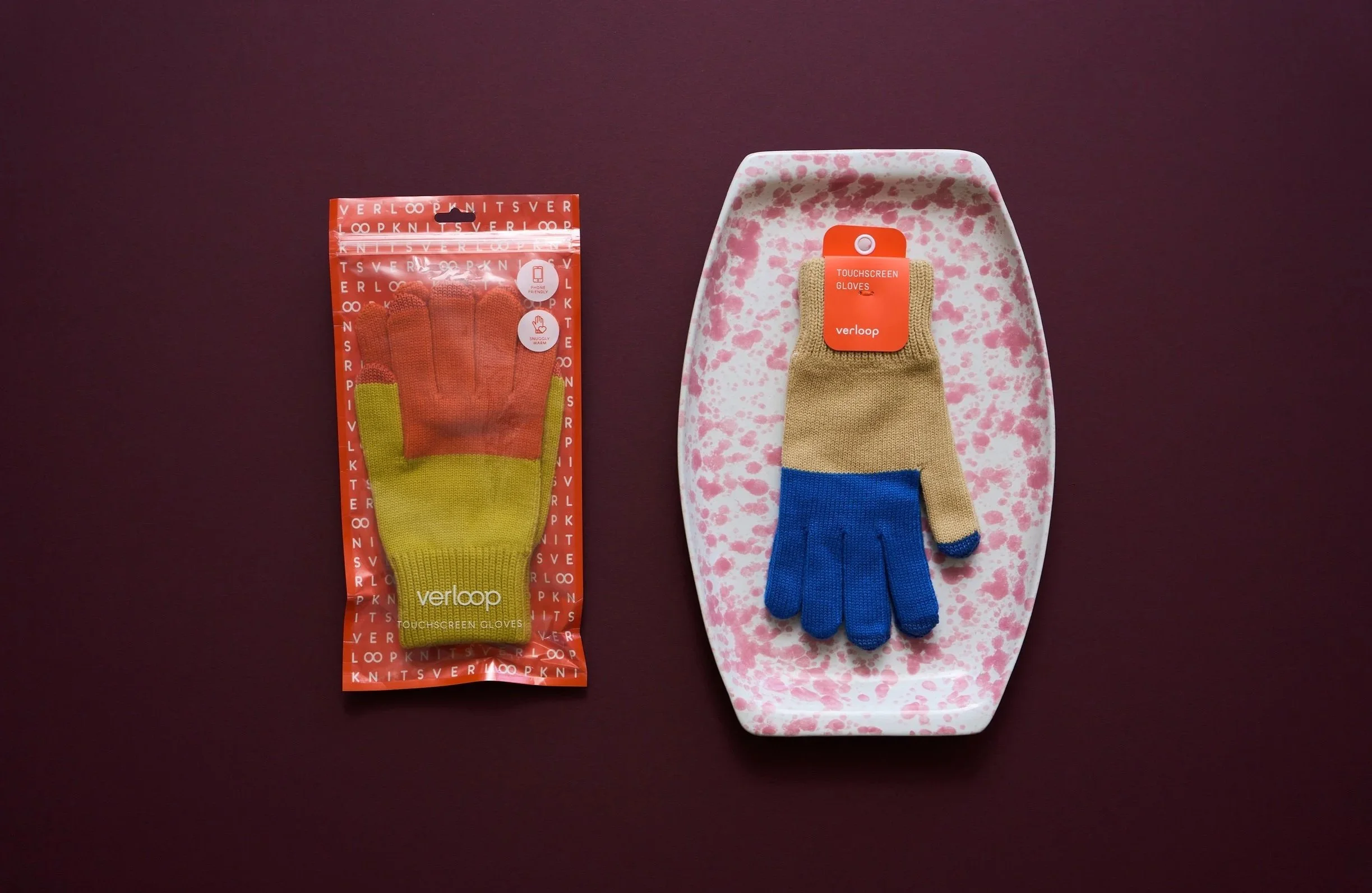
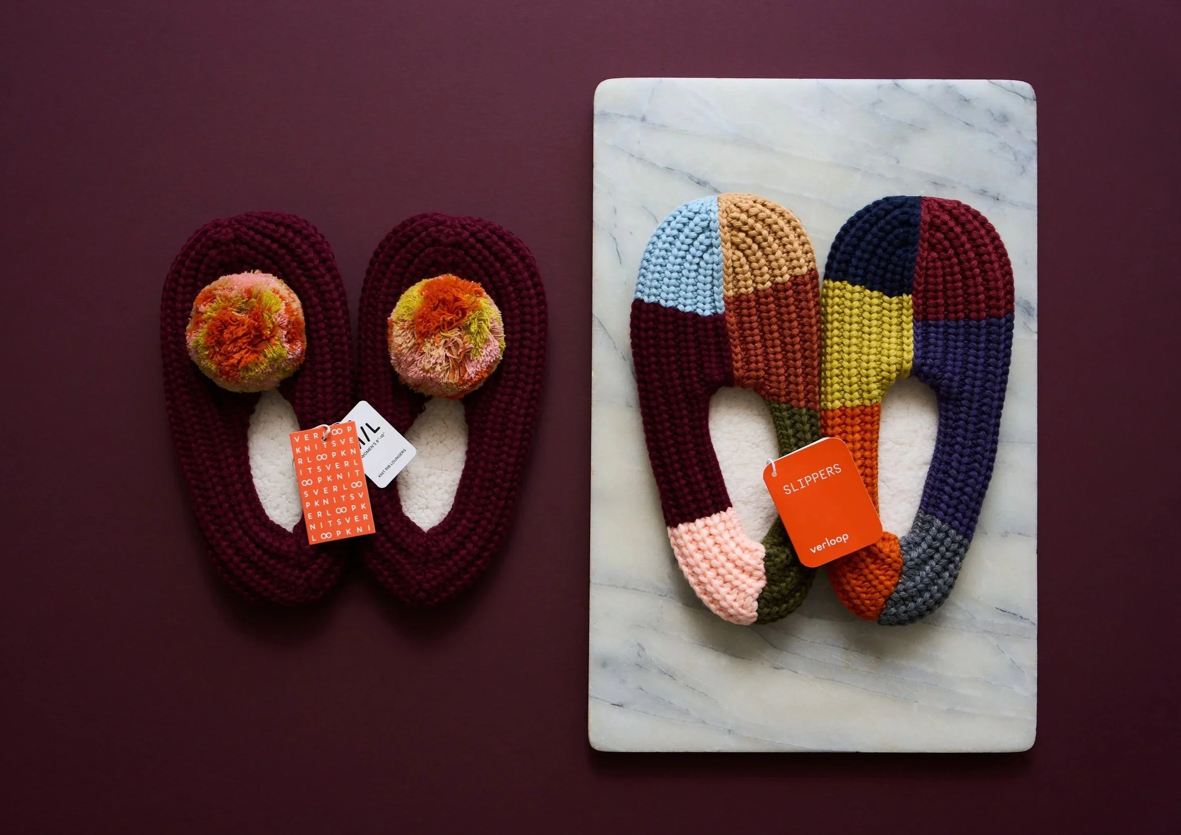
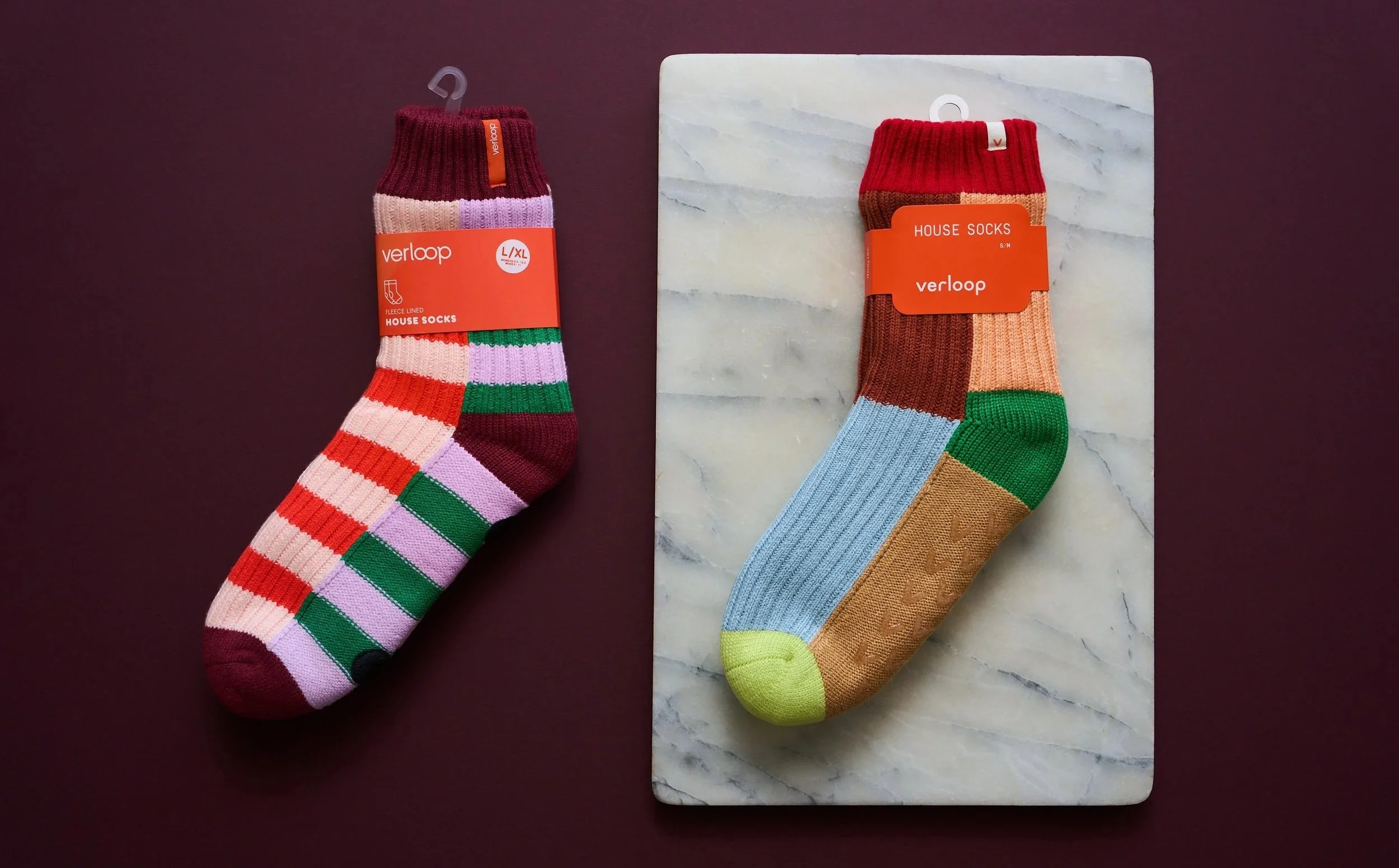
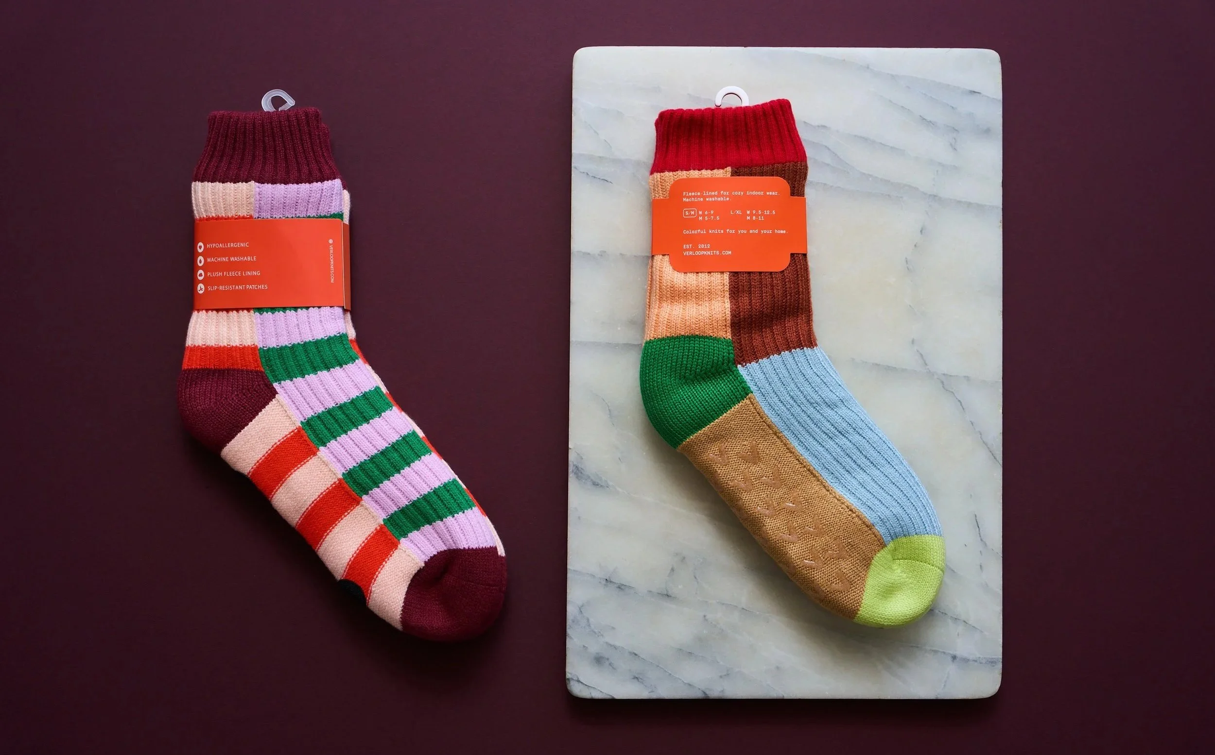
A custom-designed packaging suite minimizes plastic use, brings order and clarity to a diverse collection, and conveys quality on the shelf.
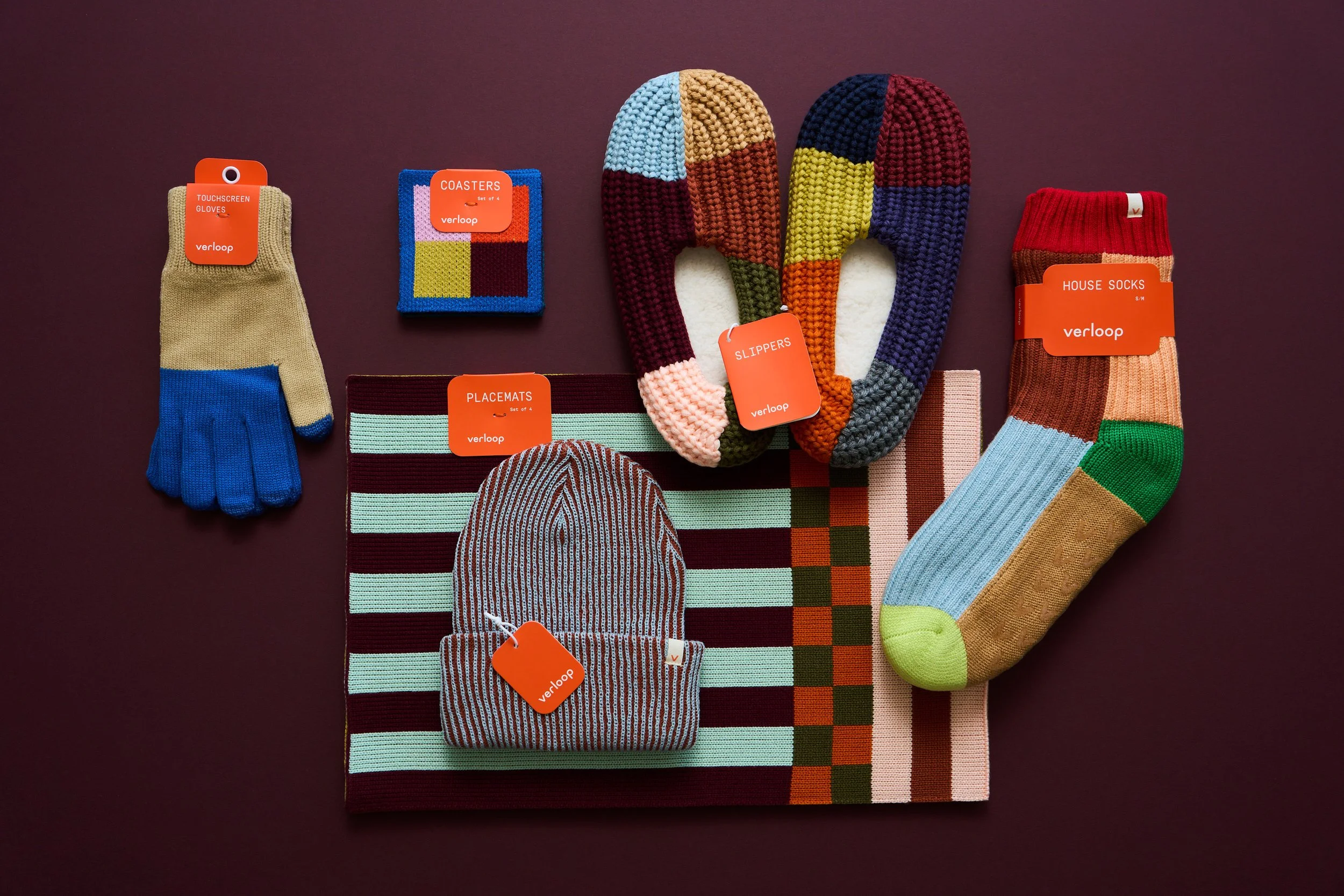
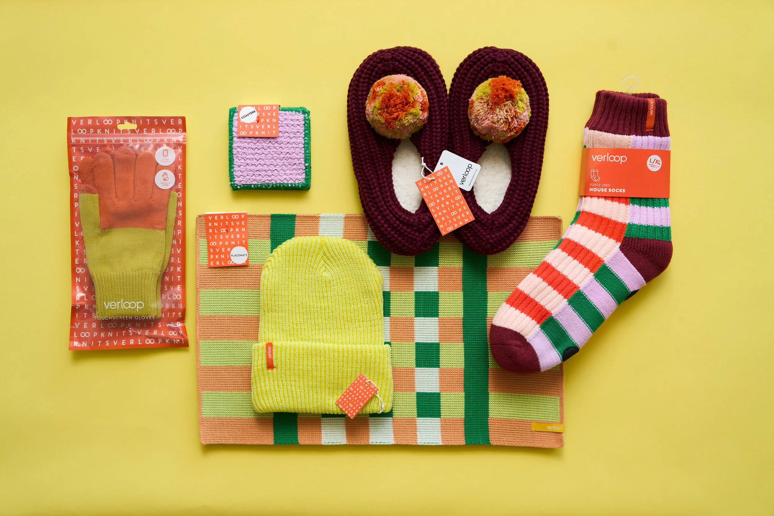
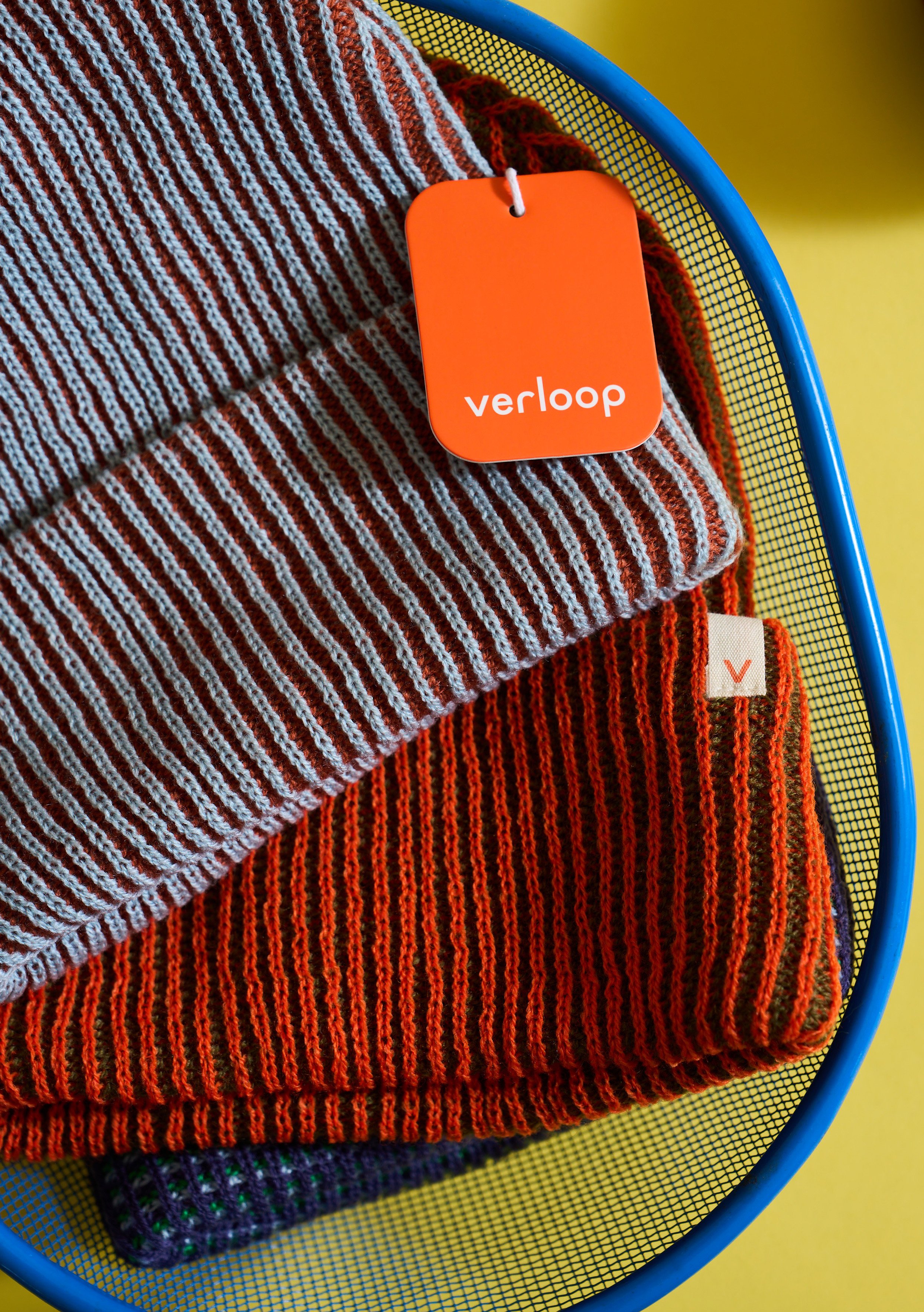
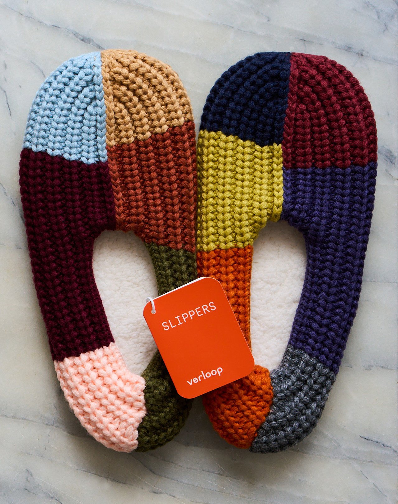
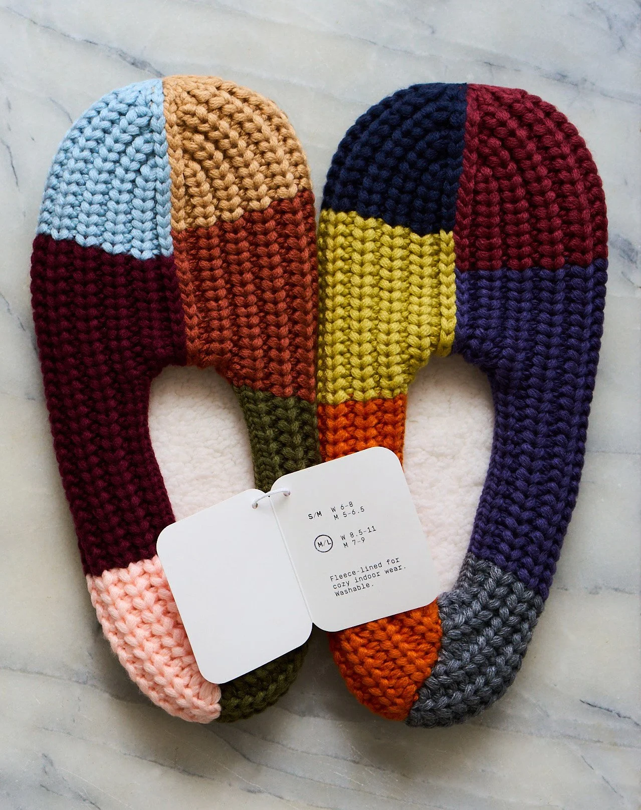
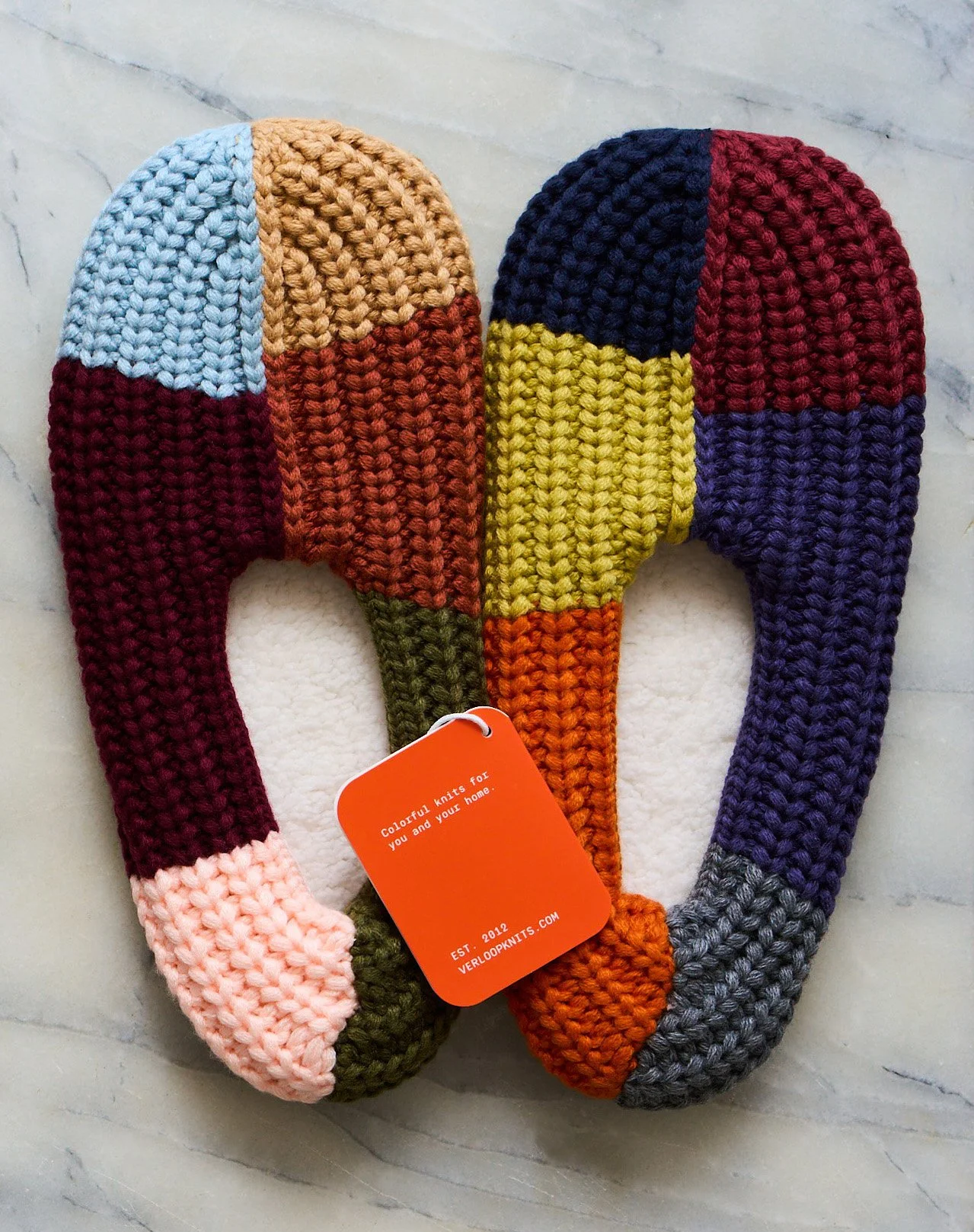
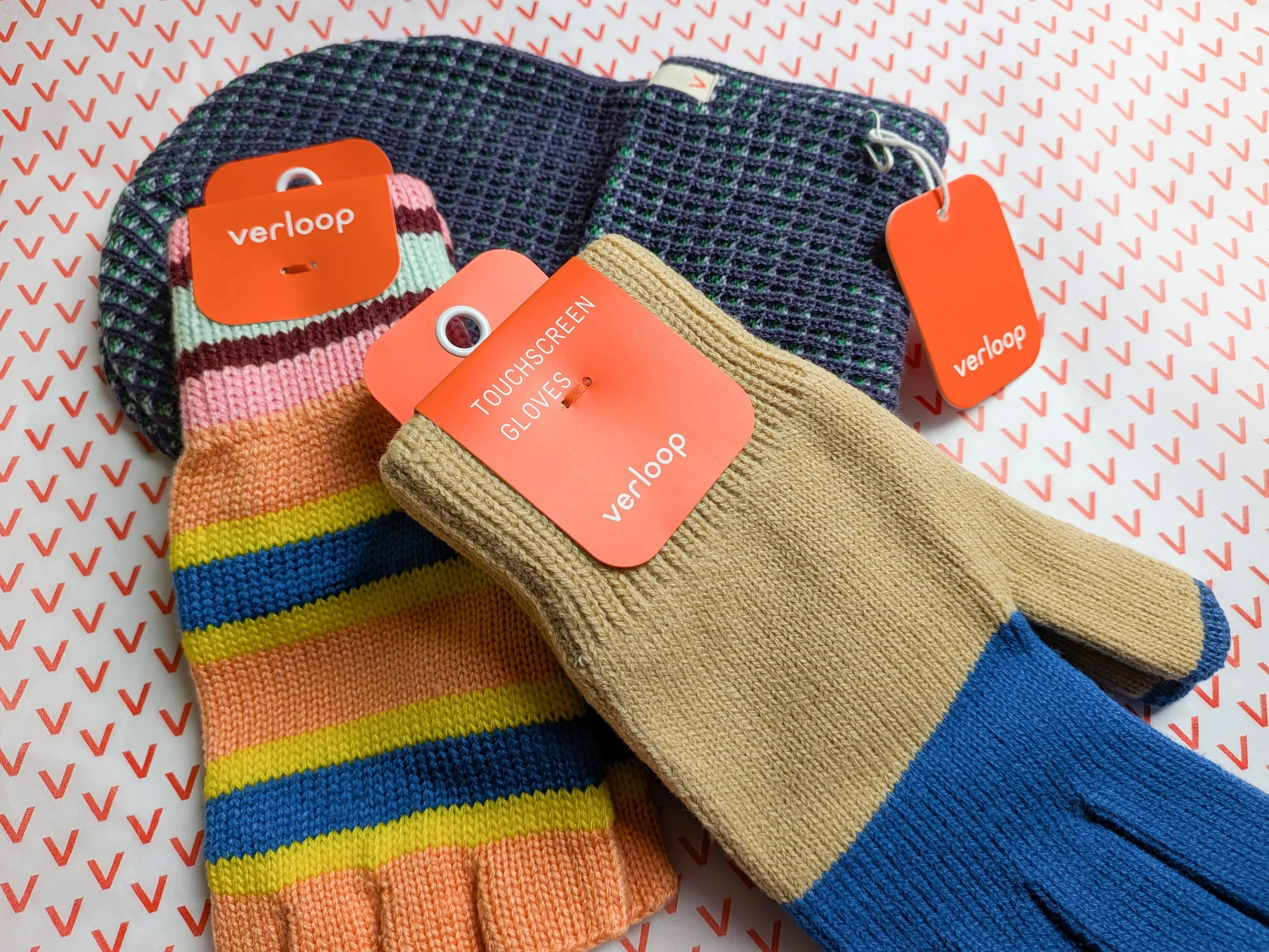
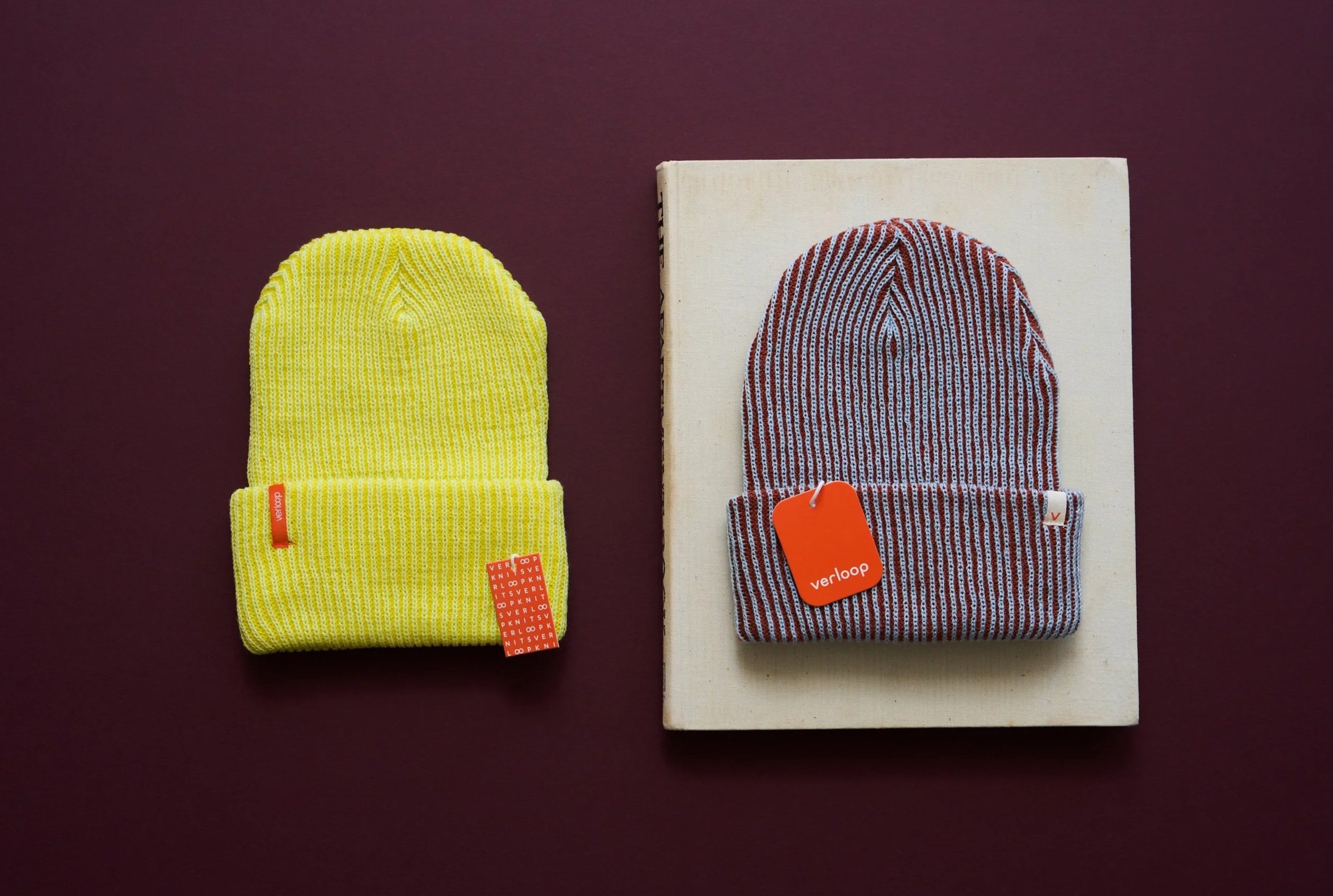
New formats enable a streamlined visual system and solve various concerns—rounded tags that won’t snag knit material, the ability to hang and try on hero products in store, clear product and sizing information, and a cohesive, eye-catching presence.
INFORMATION ARCHITECTURE
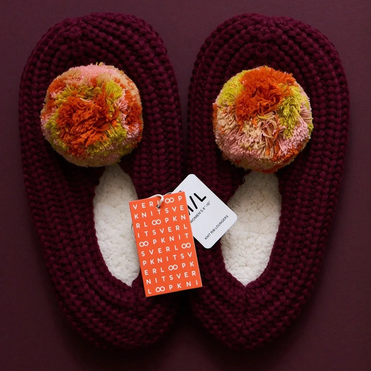
Multi-layered, multi-size tags are streamlined into an edited set of uniform folded tags with clear product titles, size charts, and brand info.
ORIGINAL:
PRODUCT DETAILS
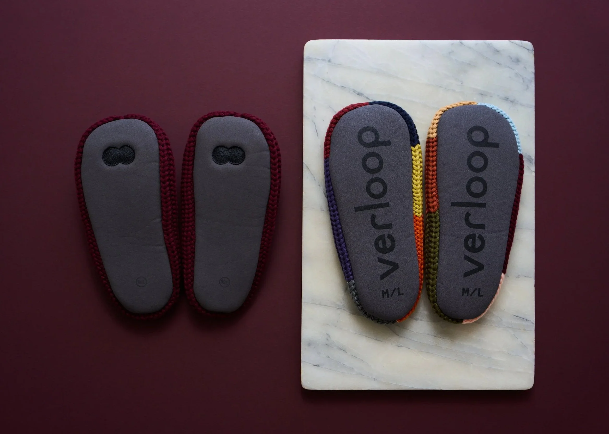
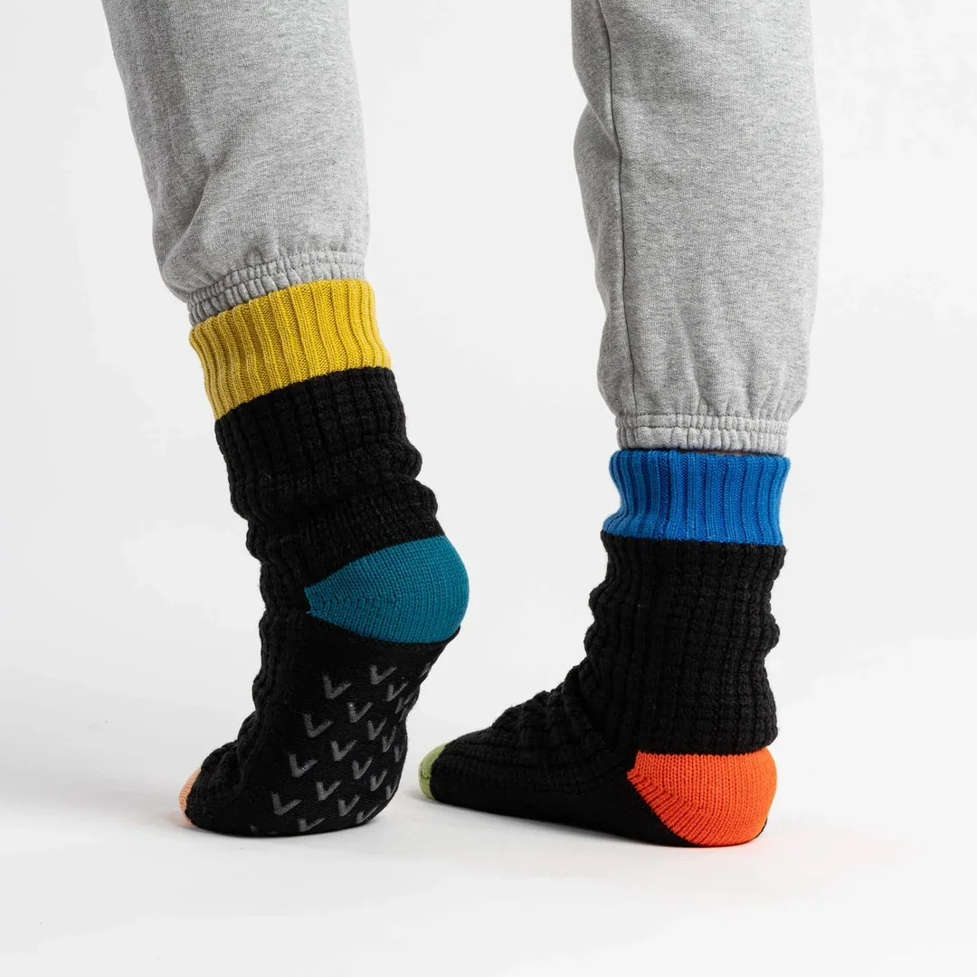
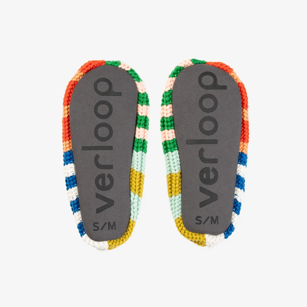
The new identity and packaging extends to upgraded product details—new unbleached twill tags, screenprint gripper soles, and functional, gift-ready wrapping.
DIGITAL PRESENCE
The new brand direction lends renewed energy to an updated website experience and photo direction. Signature elements are echoed from the packaging—rounded corners, clear typography, and bold color.
TAGLINE
More color, less waste.
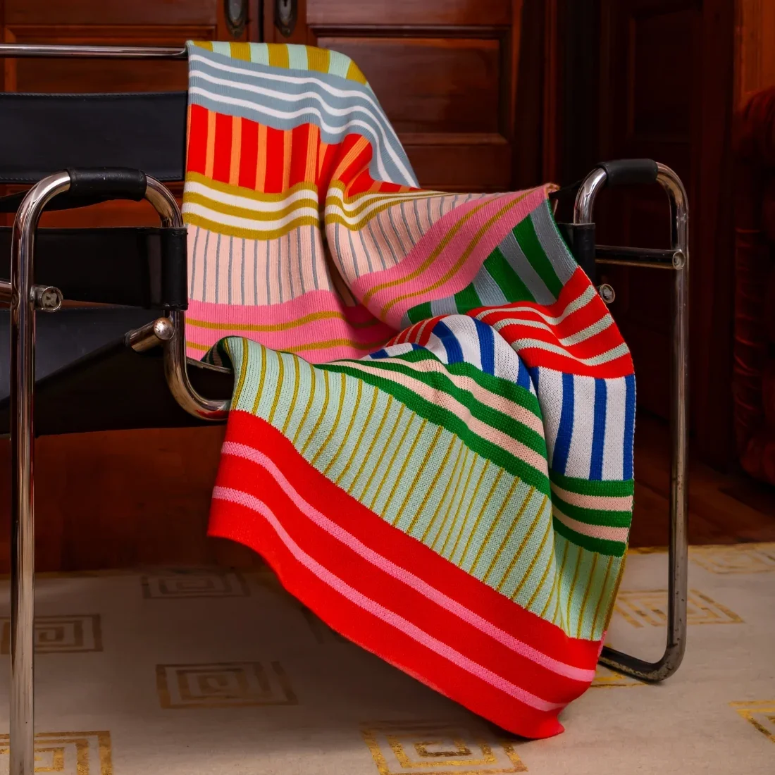
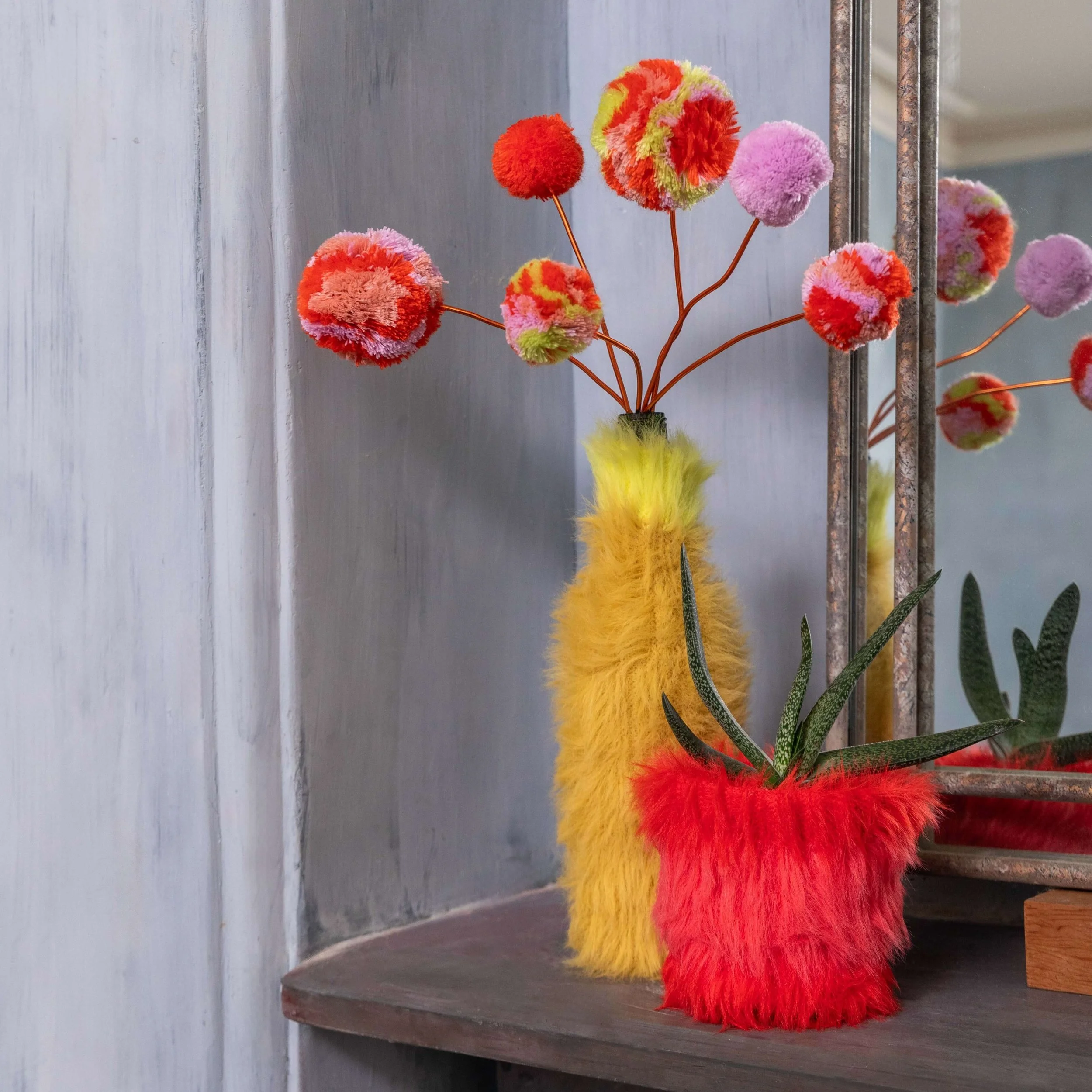
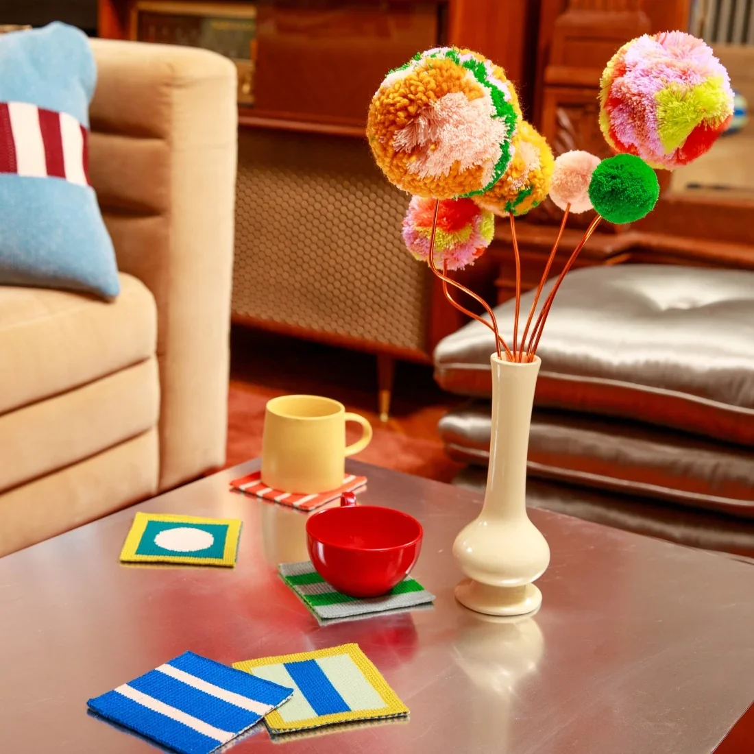

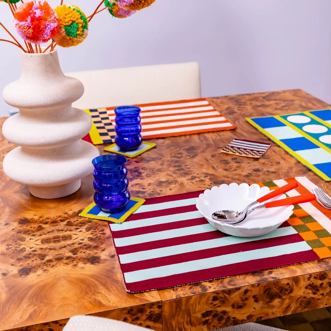



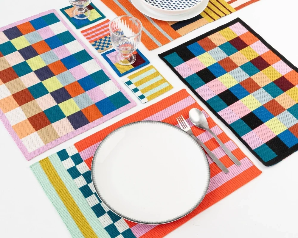
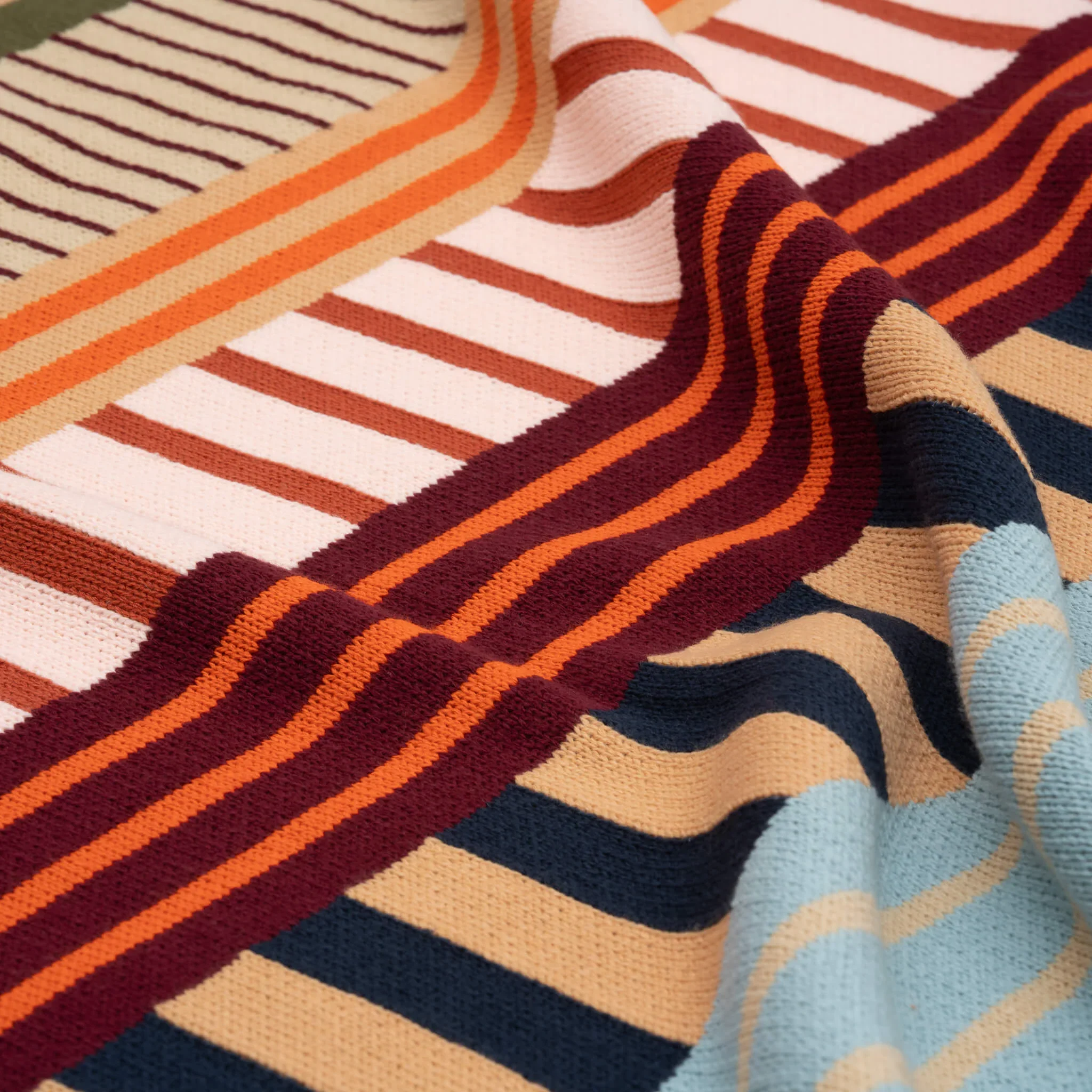

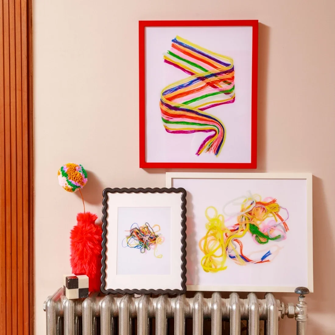
Verloop is a color-driven knits brand designing home decor and accessories with minimal waste and repurposed materials.